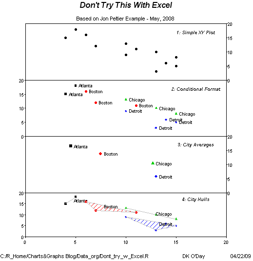
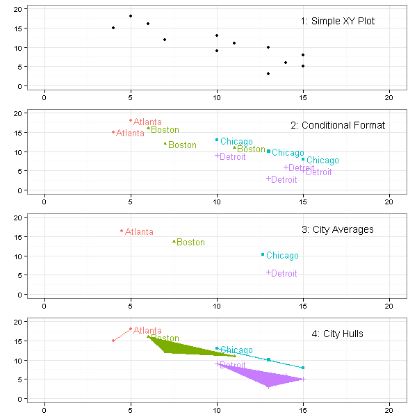
Building on the original blog post “VBA to Split Data Range into Multiple Chart Series” by Jon Peltier, and the R version in this blog and in his blog, Charts & Graphs blog “shows 4 charts of the same data to demonstrate what Excel chart users are missing by not having a more powerful charting tool. /…/ These analytical displays are not readily available to even advanced Excel users”.
He is using base graphics to draw the plots, I will present the ggplot2 version.
> library(ggplot2)
> rdata <- read.table("cities.txt", header = F,
     col.names = c("City", "X", "Y"))
> rdata <- rdata[with(rdata, order(City, Y)),
     ]
|
> theme_set(theme_bw())
> p <- ggplot(rdata, aes(X, Y, colour = City,
     fill = City, shape = City)) + xlim(0, 20) +
     ylim(0, 20) + xlab(NULL) + ylab(NULL) +
     opts(legend.position = "none")
> p1 <- p + geom_point(colour = "black", shape = 16)
|
> p2 <- p + geom_point() + geom_text(aes(label = City,
     hjust = -0.1, vjust = 0.5), size = 4.5) +
     opts(legend.position = "none")
|
> avg <- recast(rdata, City ~ variable, mean)
> p3 <- last_plot() %+% avg
|
As I want the labels to appear at max Y values, so I need to find the maximum Y, and corresponding X value for each city
> rtext <- ddply(rdata, .(City), function(df) {
     with(df, c(X = X[which.max(Y)], Y = max(Y)))
 })
> p4 <- p + geom_polygon() + geom_path(aes(group = City)) +
     geom_point() + geom_text(data = rtext,
     aes(label = City, hjust = -0.1, vjust = 0.5),
     size = 4.5) + opts(legend.position = "none")
|
Annotate
> fnannotate <- function(label) {
     annotate("text", x = 17, y = 17, label = label)
 }
> p1 <- p1 + fnannotate("1: Simple XY Plot")
> p2 <- p2 + fnannotate("2: Conditional Format")
> p3 <- p3 + fnannotate("3: City Averages")
> p4 <- p4 + fnannotate("4: City Hulls")
|
Adjust Plot margins
> pmargin <- opts(plot.margin = unit(c(0.5, 1,
     -0.5, 0.5), "lines"))
> p1 <- p1 + pmargin
> p2 <- p2 + pmargin
> p3 <- p3 + pmargin
> p4 <- p4 + pmargin
|
Plot Layout Setup
> Layout <- grid.layout(nrow = 4, ncol = 1)
> vplayout <- function(...) {
     grid.newpage()
     pushViewport(viewport(layout = Layout))
 }
> subplot <- function(x, y) viewport(layout.pos.row = x,
     layout.pos.col = y)
|
I am using a custom function for printing the individual plots in the grid to be able to capture the output in the png-file, otherwise I would only be able to save the plot rendered last.
Printing
> mplot <- function(p1, p2, p3, p4) {
     vplayout()
     print(p1, vp = subplot(1, 1))
     print(p2, vp = subplot(2, 1))
     print(p3, vp = subplot(3, 1))
     print(p4, vp = subplot(4, 1))
 }
> mplot(p1, p2, p3, p4)
|
Update: In response to Jesse’s request I have also included a plot where the x-axis ticks and the margin between the panels from all but the bottom panel has been removed.
> major_grid <- opts(panel.grid.major = theme_blank())
> no_breaks <- scale_x_continuous(breaks = NA,
     limits = c(0, 20))
> p1b <- p1 + no_breaks + opts(plot.margin = unit(c(0.5,
     1, 0, 0.5), "lines")) + major_grid
> p2b <- p2 + no_breaks + opts(plot.margin = unit(c(-1.5,
     1, 0, 0.5), "lines")) + major_grid
> p3b <- p3 + no_breaks + opts(plot.margin = unit(c(-1.5,
     1, 0, 0.5), "lines")) + major_grid
> p4b <- p4 + opts(plot.margin = unit(c(-1.5,
     1, 0.5, 0.5), "lines")) + major_grid
> mplot(p1b, p2b, p3b, p4b)
|
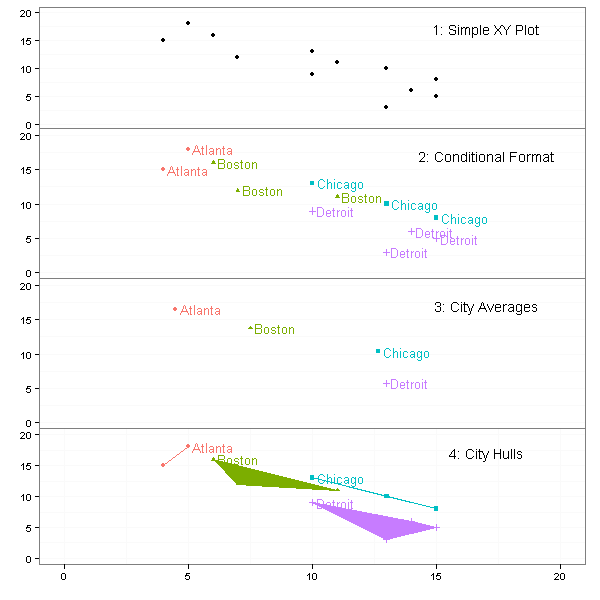


Is there a way to remove the x-axis ticks and the margin between the panels from all but the bottom panel?
Jesse: I have updated the post to reflect your request.
LearnR
Nice! It’s great to see the comparison between base graphics and ggplot2.
I notice that your polygon for Detroit looks funny. Can you use the chull() to get the convex hull?
D Kelly O’Day
http://chartgraphs.wordpress.com
I changed the sorting order of the source data and this fixed the plot.
rdata[with(rdata, order(City, Y)),]Your method doesn’t seem to work if i have more than 3 points… Can you all use chull() to create convex hulls ?
While this is impressive, I often wonder, whether ggplot2 could plot a xyplot lines joining coordinates (i.e. a matrix, each row contains a coordinates of a line that should be linked). Neither ggplot2 or even lattice xyplot could do this. But it is a toss to do this in Excel. So should we say don’t try this in R (or S-Plus)?
Athula,
If I understand you correctly, you would like to connect two points with a line.
In the example below the rows of the dataframe dt contains the coordinates of the start and endpoints of the line.
dt <- data.frame(x=sample(10), y=sample(10), xend=sample(10), yend=sample(10))ggplot(dt) + geom_segment(aes(x,y,xend=xend,yend=yend))
You can see the resulting plot here.
Thanks for all your examples on this site, it’s a great aid for those of us starting out with ggplot2. Can you also position a single label centrally on the y-axis?
Yes, you can.
Currently the y-axis labels are removed in the first step with
ylab(NULL).However, if you replaced NULL with your label and then later used e.g.
opts(theme_text(size = 12, colour = "black", angle = 90, vjust = 0.5)on one of the middle plots, andopts(theme_text(size = 12, colour = NA, angle = 90, vjust = 0.5)on the other plots, all the plots now have a y-axis label, it is just colourless (hidden) in some plots.Finally, you would have to manually adjust the vjust argument to tweak the label position.
One can make a central common y-label using grid.arrange from the package gridExtras. This function also can replace the functionality of the mplot function here.
Reblogged this on canuckish's Blog.