ggplot2: Waterfall Charts
Waterfall charts are often used for analytical purposes in the business setting to show the effect of sequentially introduced negative and/or positive values. Sometimes waterfall charts are also referred to as cascade charts.
In the next few paragraphs I will show how to plot a waterfall chart using ggplot2.
Data
A very small fictional dataset depicting the changes to a company cash position, found in a blogpost showing how to prepare a waterfall chart in Tableau.
> balance <- data.frame(desc = c("Starting Cash",
+     "Sales", "Refunds", "Payouts", "Court Losses",
+     "Court Wins", "Contracts", "End Cash"), amount = c(2000,
+     3400, -1100, -100, -6600, 3800, 1400, 2800))
> balance
           desc amount
1 Starting Cash   2000
2         Sales   3400
3       Refunds  -1100
4       Payouts   -100
5  Court Losses  -6600
6    Court Wins   3800
7     Contracts   1400
8      End Cash   2800
|
In order to preserve the order of the lines in a dataframe I convert the desc variable to a factor; id and type variable are also added:
> balance$desc <- factor(balance$desc, levels = balance$desc)
> balance$id <- seq_along(balance$amount)
> balance$type <- ifelse(balance$amount > 0, "in",
+     "out")
> balance[balance$desc %in% c("Starting Cash", "End Cash"),
+     "type"] <- "net"
|
Next the data will be slightly reworked to specify the coordinates for drawing the waterfall bars.
> balance$end <- cumsum(balance$amount) > balance$end <- c(head(balance$end, -1), 0) > balance$start <- c(0, head(balance$end, -1)) > balance <- balance[, c(3, 1, 4, 6, 5, 2)] > balance id desc type start end amount 1 1 Starting Cash net 0 2000 2000 2 2 Sales in 2000 5400 3400 3 3 Refunds out 5400 4300 -1100 4 4 Payouts out 4300 4200 -100 5 5 Court Losses out 4200 -2400 -6600 6 6 Court Wins in -2400 1400 3800 7 7 Contracts in 1400 2800 1400 8 8 End Cash net 2800 0 2800 |
Plotting
Now everything is set to plot the first waterfall chart. geom_rect is used to draw the rectangles using the coordinates calculated in the previous step.
> library(ggplot2) |
> ggplot(balance, aes(desc, fill = type)) + geom_rect(aes(x = desc, + xmin = id - 0.45, xmax = id + 0.45, ymin = end, + ymax = start)) |
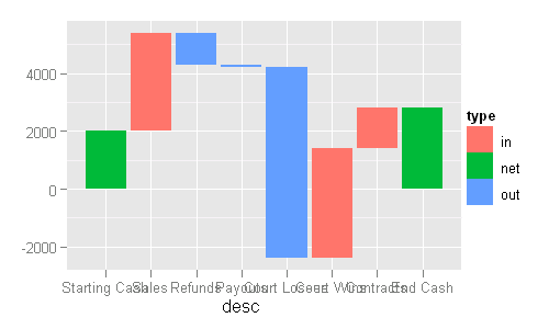
The fill mapping could use some tweaking (my preference is to have outflows in red, inflows in green, and net position in blue), for that I change the order of the underlying factor levels.
> balance$type <- factor(balance$type, levels = c("out",
+     "in", "net"))
|
Almost ready, one more tweak to the x-axis labels: the helper function below replaces spaces with new lines, making the labels more readable.
> strwr <- function(str) gsub(" ", "\n", str)
|
> (p1 <- ggplot(balance, aes(fill = type)) + geom_rect(aes(x = desc,
+     xmin = id - 0.45, xmax = id + 0.45, ymin = end,
+     ymax = start)) + scale_y_continuous("", formatter = "comma") +
+     scale_x_discrete("", breaks = levels(balance$desc),
+         labels = strwr(levels(balance$desc))) +
+     opts(legend.position = "none"))
|

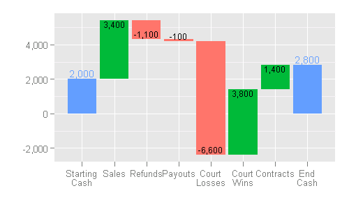
Finally, the bar labels are also added (the conditional positioning of them is quite a lengthy process, as you can see).
> p1 + geom_text(subset = .(type == "in"), aes(id, + end, label = comma(amount)), vjust = 1, size = 3) + + geom_text(subset = .(type == "out"), aes(id, + end, label = comma(amount)), vjust = -0.3, + size = 3) + geom_text(data = subset(balance, + type == "net" & id == min(id)), aes(id, end, + colour = type, label = comma(end), vjust = ifelse(end < + start, 1, -0.3)), size = 3.5) + geom_text(data = subset(balance, + type == "net" & id == max(id)), aes(id, start, + colour = type, label = comma(start), vjust = ifelse(end < + start, -0.3, 1)), size = 3.5) |


Hi:
This is a great website, haven’t seen new posts, are you planning to post more examples in the future? just wondering…
Life has been quite busy for me over the past year, but I certainly aim to make new posts in the future.
awesome example of business use case followed by R code. usually the order is reversed. i wonder how we could do this using Deducer?
I haven’t used Deducer myself, but I guess with a little manual editing of the code Deducer produces this should be achievable.
Hint: Install the package “scales”.
Thank you for the waterfall example you posted. There were some issues with newer ggplot versions which required tweaking. Below uses dplyr, simpler label positioning and segments joining the bars. Perhaps others will find it useful:
Hello All, When I tried to run the code, here is the error that I got.
Error in layer(data = data, mapping = mapping, stat = stat, geom = GeomText, :
could not find function “.”
Could you help me on this?
As ggplot2 has been updated considerably over the years, the code on this site is a bit dated. Unfortunately you would need to figure out on your own which function has been deprecated, and update your code accordingly.
Can i take this waterfall chart and change the begin to data from a database that constantly changes depanding on my filter?
The same for the end bar
Yes, you can build a dynamic chart like that.