ggplot2: Quick Heatmap Plotting
A post on FlowingData blog demonstrated how to quickly make a heatmap below using R base graphics.
This post shows how to achieve a very similar result using ggplot2.

Data Import
FlowingData used last season’s NBA basketball statistics provided by databasebasketball.com, and the csv-file with the data can be downloaded directly from its website.
> nba <- read.csv("http://datasets.flowingdata.com/ppg2008.csv")
|
The players are ordered by points scored, and the Name variable converted to a factor that ensures proper sorting of the plot.
> nba$Name <- with(nba, reorder(Name, PTS)) |
Whilst FlowingData uses heatmap function in the stats-package that requires the plotted values to be in matrix format, ggplot2 operates with dataframes. For ease of processing, the dataframe is converted from wide format to a long format.
The game statistics have very different ranges, so to make them comparable all the individual statistics are rescaled.
> library(ggplot2) |
> nba.m <- melt(nba) > nba.m <- ddply(nba.m, .(variable), transform, + rescale = rescale(value)) |
Plotting
There is no specific heatmap plotting function in ggplot2, but combining geom_tile with a smooth gradient fill does the job very well.
> (p <- ggplot(nba.m, aes(variable, Name)) + geom_tile(aes(fill = rescale), + colour = "white") + scale_fill_gradient(low = "white", + high = "steelblue")) |
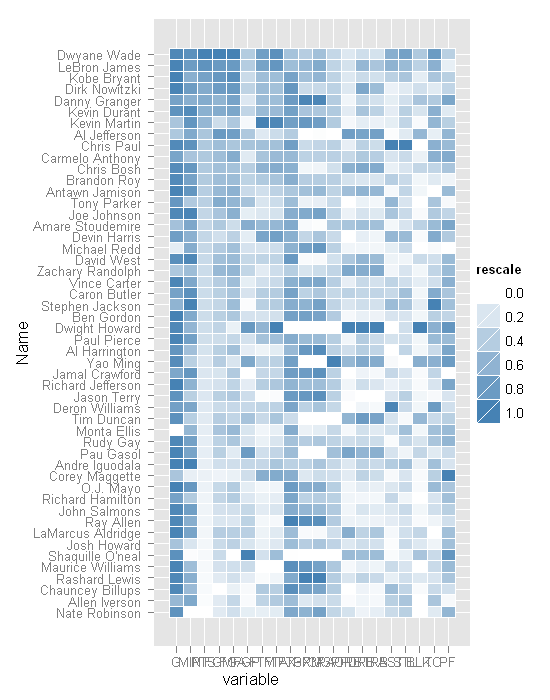
A few finishing touches to the formatting, and the heatmap plot is ready for presentation.
> base_size <- 9 > p + theme_grey(base_size = base_size) + labs(x = "", + y = "") + scale_x_discrete(expand = c(0, 0)) + + scale_y_discrete(expand = c(0, 0)) + opts(legend.position = "none", + axis.ticks = theme_blank(), axis.text.x = theme_text(size = base_size * + 0.8, angle = 330, hjust = 0, colour = "grey50")) |
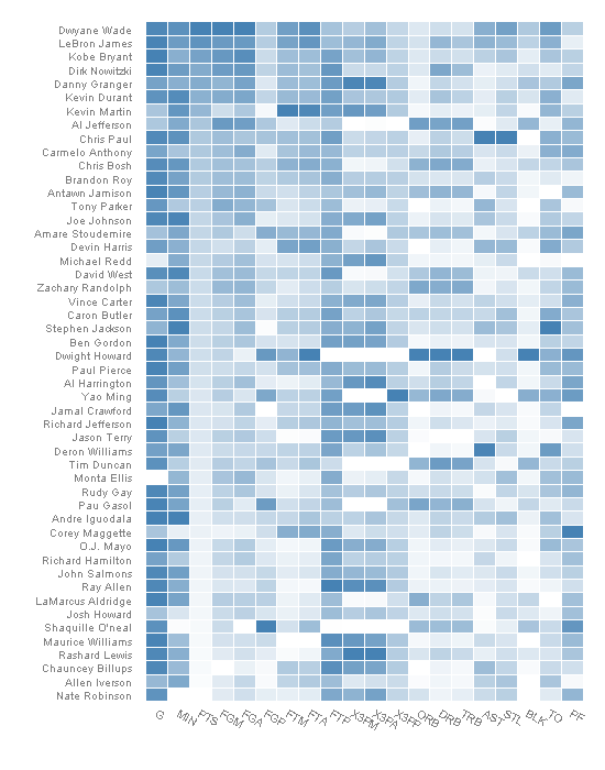
Rescaling Update
In preparing the data for the above plot all the variables were rescaled so that they were between 0 and 1.
Jim rightly pointed out in the comments (and I did not initally get it) that the heatmap-function uses a different scaling method and therefore the plots are not identical. Below is an updated version of the heatmap which looks much more similar to the original.
> nba.s <- ddply(nba.m, .(variable), transform, + rescale = scale(value)) |
> last_plot() %+% nba.s |
Trackbacks
- metachronistic » A’s 2010 Roster heatmap
- Chris Miller’s Blog » Blog Archive » Linkdump for January 28th through February 4th
- 4-More context on the “stars” | Looking Through The New York Times
- 7.5th Floor » Blog Archive » Fast Prototyping the Long Here with the Big Now
- EPL Leading Goal-scorers : PremierSoccerStats
- Pseudo-Random vs. Random Numbers in R at johnramey
- PLANET://DAMAGE » Blog Archive » HOW TO make your infographics CV (tutorial)
- Heat Map Love – R Style « Risktical Ramblings
- Visualizing Long Time Series Data with lattice, ggplot2 and D3.js | R2S
- ggplot2: Quick Heatmap Plotting, reshape? | PHP Developer Resource
- Quora
- tweaking scale heatmap with ggplot2 | Code and Programming
- Heat maps using R « minimalR
- Heat maps using R | minimalR
- 用R画heatmap | Great Power Law
- Significance level added to matrix correlation heatmap using ggplot2 | Ask Programming & Technology
- » Heatmap MarkR
- Visualizing Long Time Series Data with lattice, ggplot2 and D3.js / R2S
- Data visualisation- summarise 190 means and response rates | CL-UAT
- #Moodle component heatmap – who uses what? | Infinite Rooms Blog
- Similarity and distance in data: Part 2 | Journocode
- Team Assist Matrix Visualization | saurabh.r
- Publish R and ggplot2 to the web | information flâneur
- Using R to draw Heatmap | Gene
- ggplot2에서 heatmap 플로팅 빠르게 해보기 | THE-R


How the scaling by column (as in the original article) can be achieved?
This is exactly what this line of code does (scales all the variables or columns):
nba.m <- ddply(nba.m, .(variable), transform, rescale = rescale(value))I don’t think so. This one scales all the values. What I said is how we could scale each column separated from the others. I did something like that
nba <- read.csv("http://datasets.flowingdata.com/ppg2008.csv"😉
scaled.nba <- cbind(nba[1],apply(nba[2:21], 2, scale))
base_size <- 9
(p <- ggplot(melt(scaled.nba), aes(variable, Name)) + geom_tile(aes(fill = value), colour = "white") + scale_fill_gradient(low = "white", high = "steelblue"))
p + theme_grey(base_size = base_size) + labs(x = "", y = "") + scale_x_discrete(expand = c(0, 0)) + scale_y_discrete(expand = c(0, 0)) + opts(legend.position = "none",
axis.ticks = theme_blank(), axis.text.x = theme_text(size = base_size * 0.8, angle = 330, hjust = 0, colour = "grey50"))
I have to disagree.
nba.m <- ddply(nba.m, .(variable), transform, rescale = rescale(value))rescales each variable separately to be between 0 and 1.
> nba.m1 <- cast(nba.m[,c(1,2,4)], Name ~ variable)> nba.m1[nba.m1$Name == "Dwyane Wade ",1:5]
Name G MIN PTS FGM
21 Dwyane Wade 0.9473684 0.8787879 1 1
whereas your approach gives the following
> scaled.nba[scaled.nba$Name == "Dwyane Wade ",1:5]Name G MIN PTS FGM
1 Dwyane Wade 0.61793 1.001970 3.179941 2.920022
We are using two different approaches to scaling as evidenced by the results below:
> scale(c(1,5,15))[,1]
[1,] -0.8320503
[2,] -0.2773501
[3,] 1.1094004
attr(,"scaled:center")
[1] 7
attr(,"scaled:scale")
[1] 7.211103
> rescale(c(1,5,15))
[1] 0.0000000 0.2857143 1.0000000
We are indeed using two different approaches to scaling. The proof is that my approach gives the initial plot of your post (when the dataframe is approprietly sorted – which is something I skipped) while yours does not.
If you precompute the dataframe representing your 3d matrix, you can also use ggfluctuation(df,type=colour).
j
I’m wondering if this graph could be improved by categorizing the Stats and changing the colors. For example:
Offensive(pts, fgm, fga, 3pts m, 3pts, a) – white to red
Defensive (def rebs, off rebs, steals) – from white to green
Other /hustle ( everything else) – white to blue
So all offensive stats would be next to each other, defensive, and other. That way just by looking at the different colors you can get a grasp at where these players are excelling. Right now, its a heatmap but there’s no order to the columns and its tough to cluster all-around or offensive only players visually.
Fully agree with you, do you have any ideas how to accomplish this?
A solution to this problem has been posted by Brian Diggs at Stack Overflow: http://stackoverflow.com/a/13016912/1765910
why is it that when another dataset is supplied, the fillings are incorrect?
i supplied my own and this line:
A61B,35801,5026,2180,261,86,1430,27913,6057
looks like this:

something is off, but i don’t know (yet) what 😉
are the cells filled on a column-base? ie. if it has the highest value in the column, it is steelblue?
Sorry for the late reply.
As all the values were rescaled, then they are not filled/coloured based on the column-base.
Without seeing the sample data and the code used to generate the image, it is difficult to tell what is going wrong, I suspect a problem with sorting the data.
hi,
thanks for getting back to me. i figured it out, i missed the rescaling function.
thanks,
thomas
Just wanted to thank you for an air-tight presentation of R code that actually worked, it was such a wonderful thing! Thanks again!
How to draw if there is negative value in it. I am drawing a log graph that has values from -5 to 5 ..
This technique should work for negative values, as well.
Where did you find the “reorder” function? It doesn’t show up in any of the packages I have installed.
It is part of the stats-package, which is installed by default if I am not mistaken.
Try
stats::reorder.How right you are. I just suffered a typing malfunction “reooder”
how did you get rid of the grey plot background?
Have a look at the theming options of ggplot2.
If I remember correctly, using theme_bw() should be a good start.
hi, I have two questions.
1. My X-axis and Y-axis values are string characters, and this method automatically sorts the axis by string character. How can I get rid of the sorting?
2. Sometime it becomes difficult to distinguish the white from light blue, how can I assign colors to particular values. For my dataset, there are 5 unique values.
Otherwise, I love the graphics, keep up the good work.
Sorry for taking so long to reply to your questions.
1. If you use factors, then the strings are not sorted alphabetically, but follow the ordering of the factor levels.
2. Have a look at http://had.co.nz/ggplot2/scale_manual.html
Thanks! This tip helps a lot! The ordering issue was driving me crazy…
Thanks for the tutorial. It’s awesome. I have a quick question. In the:
(p=ggplot(megan.m, aes(variable, Name)) + geom_tile(aes(fill = value),
+ colour=”black”)+scale_fill_gradient(low=”black”,
+ high =”red”))
It seems that the color gradient from black (low) to red (high) doesn’t seem to be very obvious, especially when we have a large data set to show on the heatmap. Is it possible to have more color tones so that the color gradient is more gentle? Say, low =”black”, medium values =”orange” and high = “red”? If this is possible, how can we go about doing that?
You might want to have a look at
http://had.co.nz/ggplot2/scale_gradient2.html.
Is there a way to add the legend back onto the 2nd or 3rd heatmaps you show above? Thanks. I really have no computer programing experience at all.
If you remove
opts(legend.position = "none")from the script, the legends should reappear.Quick question: Any idea how I could get the values of the colors from the heatmap back? Thanks for any ideas.
Are you after the RGB codes of colours, or something else?
Could you please elaborate a bit what you mean, as I don’t quite understand your question.
Yeah, I’m after the RGB codes from the heatmap. I’ve been using your tutorial as a base for some of my personal projects, but I’m unsure how to get the RGB codes from each tile on the heatmap.
I am not aware of any way of getting the RGB codes other than by digging into ggplot2 source code.
I got the answer from this site: http://stackoverflow.com/questions/11774262/how-to-extract-the-fill-colours-
from-a-ggplot-object
If p is your ggplot object, then build it
p<-ggplot( something)
g <- ggplot_build(p)
And here you have the colors:
g$data[[1]]["fill"]
And you can save them to en exel file using:
library(xlsx)
write.xlsx(g$data[[1]], "mydata.xlsx")
Hi,
I was just wondering what does the step
base_size <- 9
do?
Thx
This sets the font size in the theme used.
Thanks for your reply. How do I get rid of the white grid lines between the boxes?
Something different. For this graph, the x axis is at the bottom and y on the left side. How do I plot x axis on the top and y axis on the left side?
Check out
opts(panel.grid.major = theme_blank())oropts(panel.grid.minor = theme_blank())In response to your second question, I don’t think it is not currently possible to have x-axis on top.
Thanks again for your reply. Based on this concept I have inplemented a very interesting plot in R. Do you think I can post it here?
Of course, you can post it here.
http://tinypic.com/r/o8cfm0/7
http://tinypic.com/r/2uiizvb/7
This was created in ggplot2 similar to a heatmap.
The input datafile is too big to post here.
Hi Roy, how did you move the x-axis to the top of the heatmap? Thanks.
This is very useful. Thanks.
Does anyone know how do add the actual values of the dataframe within the heatmap?
Could you please elaborate a bit more what you are trying to do?
What I meant is that I’d like to be able to see the actual value of the gradient used to pick the color in the matrix. So you can start by looking to the heatcolors, and then if necessary look at the actual value used in the matrix.
I’m in the same boat; I’d like to overlay each colored tile with the actual value used to choose the color.
Use geom_text() to add the values to each tile.
Is it possible to show clusters/density/contour on these heatmaps?
For example: Put a circle over the dark blue clusters.
You would need to calculate the coordinates separately, and then it would be possible.
I found this forum very useful and i would like to thanks all the users specially @learnr.
Now i have enough idea to start with heatmap. will get back to you people in case i got an trouble.
Best Regards
I thought the post using ggplot2 to display heatmaps was really excellent!. However, for the “tweaking” of the appearance I get the following error:
” Error in unit.c(margin$left, widths, margin$right) :
It is invalid to combine unit objects with other types”
Any idea why that might be?
This code worked great! However, what if I don’t want to reorder the dataset? I tried not including this line:
nba$Name <- with(nba, reorder(Name, PTS))
I am dealing with countries and they are still ordered in reverse alphabetical order for some reason. What if I want to keep the original ordering of my dataframe? Thanks so much!
I think ggplot2 automatically sorts the axis categories. You can keep the original ordering by converting the sorting variable into factor and adjusting the levels accordingly.
“I think ggplot2 automatically sorts the axis categories. You can keep the original ordering by converting the sorting variable into factor and adjusting the levels accordingly.”
I use R but I am not expert. I have to plot a heat map of my 2×2 matrix. I am wondering how to preserve the original ordering.
Could you explain it in the case of the above example.
nba$Name <- with(nba, reorder(Name, PTS))
Which is the sorting variable in the above example. and how to adjust the levels.
From
?reorder: the first argument is a categorical variable, and its levels are reordered based on the values of a second variable, usually numeric.So
nba$Name <- with(nba, reorder(Name, PTS))reorders the names based on points scored.I’m in the exact same situation as Alissandra and Sridhra; I would like to know how to get the heatmap plot to keep the rows and columns ordered in the exact way of the original data. Can you please provide the exact code to do such? This is my 1st attempt at using R, so I’m unsure of the methods that could even allow me to do this. Thanks!
You would need to convert the original rows and columns to a factor, and to keep the order use the levels argument of
factor().You might want to take a look at this blog post for inspiration.
just want to say one can create heatmap of data in excel using
conditional formatting > color scales
Can I ask how to draw a heatmap for just one column, as my data has only one variable and I want display it by heatmap? Thanks!
I assume you still have x & y variables, so the technique remains the same as in the post above.
Yes, I was trying to understand this forum because of novice. I have to say this technique is beautiful. Can you give me an example of single x&y variables of your function? Say nba$Name vs nba$PTS. The transformation of the raw data confused me and I am totally lost. with nba.m.
Thanks!
Thanks for the article; it’s the best heatmap example I’ve seen. However, I have a question. What am I supposed to pass as params to aes()? The help page for aes() mentions specifying x and y, but in our case, what would that be? I’ve tried several things but am clueless.
Please help. Thanks!
aes function takes care of the aesthetic mappings of variables at the time the plot is rendered.
Could you please be a bit more specific as to which case you are referring to?
I tried using following script:
ggplot(nba.m, aes(variable==”PTS”, Name)) + geom_tile(aes(fill = rescale), colour = “white”) + scale_fill_gradient(low = “white”, high = “steelblue”))
I believe the column FALSE is what I need, but there is an extra column (TRUE) alongside. How to remove this extra column? Unfortunately I can’t post the figure here.
Thanks!
If you only want to plot a heatmap of the individual points scored then try this:
ggplot(subset(nba.m, variable==”PTS”), aes(variable, Name)) + geom_tile(aes(fill = rescale), colour = “white”) + scale_fill_gradient(low = “white”, high = “steelblue”))Thanks Learnr!
This is a great tutorial on heatmap, that can be used for my purpose. Actually my data structure is a little different from the NBA data that only contains two columns: one for the row names (X) and one for observation (Y).
————————
Var1 Freq
10 1
426 1
543 4
555 1
569 3
570 1
577 2
594 3
811 2
849 35
866 9
868 20
…
————————
The Var1 can be treated as string as row.names. That’s why I asked how to handle one variable. I tried following script:
data <-read.csv("/home/yifang/20110818-Ron/cs02.csv")
row.names(data) <- data$Var1
data.m <- melt(data)
data.m <- ddply(data.m, .(variable), transform, rescale = rescale(value))
ggplot(subset(data.m, variable=="Freq"), aes(variable, Var1)) + geom_tile(aes(fill = rescale), colour = "white") + scale_fill_gradient(low = "white", high = "Red")
But the biggest problem is the color which is so faint. Probably this is not the right tool I should use, but your tutorial gave me the closest idea of what I want. How to improve my script?
Thanks!
Yifang
I’m trying to put 5 heatmaps on one plot. I added a column to my original data frame which is string variables designating which plot (i used rbind to put together all 5 data sets). then I tried simply adding the command
facet_wrap(~sim)
to my ggplot (sim is the name of the column which identifies each of the 5 groups). i get a lot of errors which i think are due to the fact that for each column/row pair, I now have 5 values (which i want to split up, but ggplot is still getting confused as to which one goes where). any ideas?
thanks!
As you do not reveal any of the errors you are getting, it is quite difficult to guess where the problem might be.
Hi there,
in your very first heatmap in this post the labels for the x-axis are on top of the heatmap. How did you achieve that? I have not found any option to set it like that.
Thanks!
PS: Thank you a lot for this post – I have already used it with great succes and find it very useful!
The first plot is from the original article, and I believe has been modified by hand.
wow really cool thanks for sharing. What package did you use to find the rescale function?
rescalefunction is nowadays part of thescalespackage.Thanks for the reply 🙂 My heat map is off and running! I used red though 😛
Quick Q: Do functions like rescale go away with new versions of R? Are they a lot of functions like this?
No they do not. The author of this function just moved it to a new package.
package plotrix has rescale()
there is also a rescale function in plotrix
Is there any way to print the values on the coloured tiles?
Yes, use geom_text().
Thanks for the tutorial. I just have a few questions/potential suggestions depending on your intended audience. It would be very useful in you could expand on you descriptions of what each line of code is actually doing and how it is formatted (such as when you mention rescaling but give little detail beyond the code about exactly how the rescaling function works, this left me unsure whether the rescale used would be at all appropriate for my data, instead it was just kind of a mystery function, plus it left me not knowing how to modify it to my ends). Also, you didn’t mention that the melt function you call on is not (so far as I can tell) included with R or ggplot2, but rather comes with the “reshape” libraries. Maybe your audience is supposed to be experienced users so I just failed to come to the site with enough foundation to use the tutorial. At any rate, it was still somewhat helpful.
Thanks for your comments.
The used packages have evolved over the years, and some of the mechanics have changed on the way. For example, in previous versions
ggplot2was loadingreshapeandplyrpackages, this is not so any more.If you ever come across a function you do not know, the easiest and safest way is to browse its help pages.
?rescaleor??rescalewould give you background information on how the function operates.Hey, thanks for this awesome post.
I have a question, where can I find the rescale function in R?
It has been moved to
library(scales).may anyone help with me ? it says: Could not find function”melt” Thanks
> nba nba$Name library(ggplot2)
> nba.m
You need
library(reshape2)Hi, after I installed reshape package, I still got this:
> library(reshape)
Loading required package: plyr
Attaching package: ‘reshape’
The following object(s) are masked from ‘package:plyr’:
rename, round_any
>
How to solve this ?
This is not a problem, and does not to be solved – these are just messages displayed on loading of the package.
I was wondering if i wanted to change the proportions of the tiles, i have tried to use geom_tile(aes(fill = value),colour = “grey”, width=0.2, height=2). It makes them more narrow, but does not change the heatmap it self, how do i do that?
Sorry, I do not quite understand what you are trying to achieve.
With the current version of ggplot2 (1.0.0) the opts function is deprecated. You have to change some lines of the code of the formatting to avoid the warnings.
It should be:
base_size <- 9
p <- p + theme_grey(base_size=base_size)
p <- p + labs(x="", y="")
p <- p + scale_x_discrete(expand = c(0,0))
p <- p + theme(legend.position="none", axis.ticks=element_blank(), axis.text.x=element_text(size=base_size*0.8, angle=330, hjust = 0, colour="grey50"))
By the way, great example!!!
I am wondering if there is any way in ggplot2 to vary the colour of the of the text on the y-axis so that some of the names are a particular colour and others are a different colour. For example, could you make it so that all the names of all the players from the Eastern Conference are in red while those in the Western Conference are in blue?
R Studio is crashing on this command:
nba.s <- ddply(nba.m, .(variable), transform,rescale = scale(value))
Has one of the functions been deprecated?
The complete code should be as the following:
library(“ggplot2”)
library(“plyr”)
library(“reshape”)
library(“scales”)
nba <- read.csv("http://datasets.flowingdata.com/ppg2008.csv"😉
nba$Name <- with(nba, reorder(Name, PTS))
nba.m <- melt(nba)
nba.m <- ddply(nba.m, .(variable), transform,rescale = rescale(value))
p <- ggplot(nba.m, aes(variable, Name)) +
geom_tile(aes(fill = rescale),colour = "white") +
scale_fill_gradient(low = "white",high = "red")
plot(p)
base_size <- 9
p + theme_grey(base_size = base_size) + labs(x = "",y = "") + scale_x_discrete(expand = c(0, 0)) +
scale_y_discrete(expand = c(0, 0)) +
theme(legend.position = "none",axis.ticks = element_blank(), axis.text.x = element_text(size = base_size * 0.8, angle = 330, hjust = 0, colour = "grey50"))
Thanks for your codes, they are really helpful
Hello,
Could you please provide additional information on how the rescale function is working? I would like to know exactly how it is changing my data.
Thanks!
Kim
Re:
nba.s <- ddply(nba.m, .(variable), transform,
+ rescale = scale(value))
library(scales)?rescaleReblogged this on Planet1019 and commented:
ggplot-heatmap