ggplot2: Marimekko/Mosaic Chart
Another variation of the variable width column chart is a Marimekko chart or mosaic chart or eikosogram. In many marketing departments this chart is used to show proportion of a product market by region, and proportion of region by product. Jon Peltier’s tutorial demonstrates the technique to create one in Excel.

Let’s attempt to do the same in ggplot2.
We start with creating the dataframe to work with…
> df <- data.frame(segment = c("A", "B", "C",
     "D"), segpct = c(40, 30, 20, 10), Alpha = c(60,
     40, 30, 25), Beta = c(25, 30, 30, 25),
     Gamma = c(10, 20, 20, 25), Delta = c(5,
         10, 20, 25))
|
Next, I add a few helper variables, and convert the data to long format.
Calculate cumulative width on x-axes, starting point of each column and erase segpct variable.
> df$xmax <- cumsum(df$segpct) > df$xmin <- df$xmax - df$segpct > df$segpct <- NULL |
Data looks like this before the long-format conversion:
> head(df) segment Alpha Beta Gamma Delta xmax xmin 1 A 60 25 10 5 40 0 2 B 40 30 20 10 70 40 3 C 30 30 20 20 90 70 4 D 25 25 25 25 100 90 |
After melting the data looks like this:
> library(ggplot2) |
> dfm <- melt(df, id = c("segment", "xmin", "xmax"))
> head(dfm)
  segment xmin xmax variable value
1       A    0   40    Alpha    60
2       B   40   70    Alpha    40
3       C   70   90    Alpha    30
4       D   90  100    Alpha    25
5       A    0   40     Beta    25
6       B   40   70     Beta    30
|
Now we need to determine how the columns are stacked and where to position the text labels.
Calculate ymin and ymax:
> dfm1 <- ddply(dfm, .(segment), transform, ymax = cumsum(value))
> dfm1 <- ddply(dfm1, .(segment), transform,
     ymin = ymax - value)
|
Positioning of text:
> dfm1$xtext <- with(dfm1, xmin + (xmax - xmin)/2) > dfm1$ytext <- with(dfm1, ymin + (ymax - ymin)/2) |
Finally, we are ready to start the plotting process:
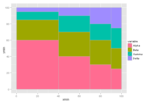
> p <- ggplot(dfm1, aes(ymin = ymin, ymax = ymax,
     xmin = xmin, xmax = xmax, fill = variable))
|
Use grey border to distinguish between the segments:
> p1 <- p + geom_rect(colour = I("grey"))
|
The explanation of different fill colours will be included in the text label of Segment A using the ifelse function.
> p2 <- p1 + geom_text(aes(x = xtext, y = ytext,
     label = ifelse(segment == "A", paste(variable,
         " - ", value, "%", sep = ""), paste(value,
         "%", sep = ""))), size = 3.5)
|
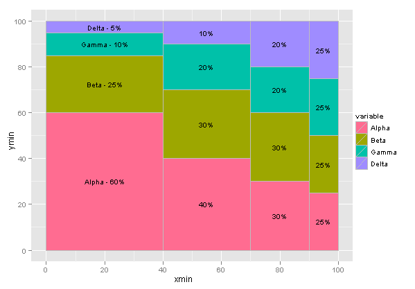
The maximum y-axes value is 100 (as in 100%), and to add the segment description above each column I manually specify the text position.
> p3 <- p2 + geom_text(aes(x = xtext, y = 103,
     label = paste("Seg ", segment)), size = 4)
|

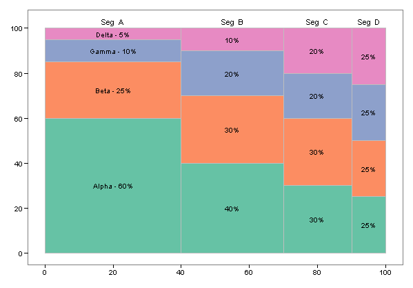
Some last-minute changes to the default formatting: remove axis labels, legend and gridlines.
> p3 + theme_bw() + labs(x = NULL, y = NULL,
     fill = NULL) + opts(legend.position = "none",
     panel.grid.major = theme_line(colour = NA),
     panel.grid.minor = theme_line(colour = NA))
|

Or, if the default palette is not to one’s liking it is very easy to use a ColorBrewer palette instead:
> last_plot() + scale_fill_brewer(palette = "Set2") |
Trackbacks
- Spinning multi-color 2 | weloveyourwalls design blog
- Statistical Graphics and more » Blog Archive » Don’t call me “Marimekko”
- Mosaic time series in R » Statistical Algorithms
- Electoral Marimekko Plots « David B. Sparks
- How to create a Marimekko/Mosaic plot in ggplot2 | Ask & Answers
- GGplot2 – Ekaterina Volkova


Nice, i just wonder if perhaps you shouldn’t set expand=c(0,0) on both axes (percent wouldn’t make much sense beyond this range). I wouldn’t know how to place the labels outside the plot area in ggplot2 though.
Should the area of each segment be proportional to its size (instead of to the x size)?
This is really helpful! I do have a question about applying colors to the chart though. I’m trying to apply scale_colour_grey to the chart, but I get a warning (45: In grid.Call.graphics(L_lines, x$x, x$y, index, x$arrow) :supplied color is not numeric nor character) and it doesn’t actually apply the colors. I’m wondering if there’s a limit on the number of colors in a scale as there are 14 sections within the segments (equivalent to your Alpha/Beta/Gamma/Delta). I’m not quite sure how to fix it. Any ideas?
Check whether your fill variable is continuous and not discrete. As far as I can tell there are no limits on the number of shades of grey in a scale.
Reblogged this on deseRt scrolls.
Thank you ever so much! This manual was very appreciated!