ggplot2: Bump Chart
May 6, 2009
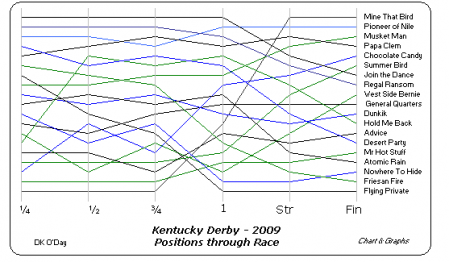
Charts & Graphs blog has posted a 2009 Kentucky Derby bump chart made in Excel.
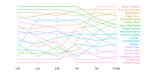
Next a similar bump chart would be constructed in ggplot2.
After typing the horse positions into a csv-file, importing it into R, the bump chart using ggplot2 default settings looks like this.
> library(ggplot2)
> df <- read.csv("derby.csv")
> df$Horse <- with(df, reorder(Horse, Finish))
> dfm <- melt(df)
|
> p <- ggplot(dfm, aes(factor(variable), value,
     group = Horse, colour = Horse, label = Horse))
> p1 <- p + geom_line() + geom_text(data = subset(dfm,
     variable == "Finish"), aes(x = factor(variable +
     0.5)), size = 3.5, hjust = 0.8)
|

Not very nice. However, the impression changes after a few cosmetic changes to the default formatting: format x-axis labels, remove legend & axis ticks, also change the sort order of y-axis.
> labels <- c(expression(1/4), expression(1/2),
     expression(3/4), "1m", "Str", "Finish",
     "")
|
> p1 + theme_bw() + opts(legend.position = "none",
     panel.border = theme_blank(), axis.ticks = theme_blank()) +
     scale_x_discrete(breaks = c(levels(dfm$variable),
         ""), labels = labels) + scale_y_continuous(breaks = NA,
     trans = "reverse") + xlab(NULL) + ylab(NULL)
|
13 Comments
leave one →


Where can I obtain a copy of the (“derby.csv” file (horse position for 2009 Kentucky Derby). I’d like to try and use ggplot2 and recreate this plot. Thanks!
wordpress.com doesn’t allow to upload csv-files, unfortunately.
However, copy-paste the code below to replace
df <- read.csv("derby.csv").df <- structure(list(Horse = structure(c(11L, 16L, 13L, 15L, 3L, 18L, 10L, 17L, 19L, 8L, 5L, 9L, 1L, 4L, 12L, 2L, 14L, 7L, 6L), .Label = c("Advice", "Atomic Rain", "Chocolate Candy", "Desert Party", "Dunkirk", "Flying Private", "Friesan Fire", "General Quarters", "Hold Me Back", "Join in the Dance", "Mine That Bird", "Mr. Hot Stuff", "Musket Man", "Nowhere to Hide", "Papa Clem", "Pioneer of the Nile", "Regal Ransom", "Summer Bird", "West Side Bernie"), class = "factor"), X1.4 = c(19L, 3L, 8L, 5L, 17L, 16L, 1L, 2L, 13L, 12L, 9L, 14L, 15L, 4L, 18L, 10L, 11L, 6L, 7L), X1.2 = c(19L, 3L, 8L, 4L, 12L, 16L, 1L, 2L, 17L, 13L, 10L, 5L, 15L, 6L, 18L, 9L, 14L, 7L, 11L), X3.4 = c(19L, 4L, 7L, 3L, 15L, 16L, 1L, 2L, 14L, 11L, 9L, 6L, 17L, 5L, 18L, 10L, 12L, 8L, 13L), X1m = c(12L, 2L, 7L, 4L, 8L, 15L, 1L, 3L, 17L, 10L, 11L, 5L, 13L, 6L, 16L, 9L, 18L, 14L, 19L), Str = c(1L, 2L, 4L, 3L, 7L, 9L, 5L, 6L, 13L, 10L, 12L, 8L, 14L, 11L, 16L, 15L, 18L, 17L, 19L), Finish = 1:19), .Names = c("Horse", "X1.4", "X1.2", "X3.4", "X1m", "Str", "Finish"), class = "data.frame", row.names = c(NA, -19L))Ohhhhhh. The geek in me is memerized by the possibilities. Thanks!
Great tutorial. I’m trying to amend it to some college football rankings showing the college name on the y axis (cf your horse name) at both the start and finish. The x axis is the weekly ranking – where the numbers of weeks may vary by year of ranking
I use scale_x_continuous(breaks=c(1:(max(cfRanking$week)))) to show each week but I am not sure how to set the college names at each end. Currently they are on the main graph and am having bit of a problem duplicating your labels methofd of adding extra fiels (or 2 in my case)
cheers
It’s a bit tricky to respond to you without seeing the actual code that is causing you problems.
Thanks for reply. The relevant code from the script is here
cfRanking <- sqlQuery(channel,paste(
"select rank,college,week
from collegefootballrankings
where season = 2010 and rank <16
order by week desc, rank
"
));
p <- ggplot(cfRanking, aes(week, rank, group = college, colour = college, label = college))
p1 <- p + geom_line() + geom_text(data = subset(cfRanking,
week == min(cfRanking$week)), aes(x = week), size = 2.5, hjust = 0.2) + geom_text(data = subset(cfRanking,
week == max(cfRanking$week)), aes(x = week), size = 2.5, hjust = 0.3)
png("cfrankings.png")
p2 <-p1 + theme_bw() + opts(legend.position = "none",
panel.border = theme_blank(), axis.ticks = theme_blank()) +
scale_x_continuous(breaks=c(1:(max(cfRanking$week)))) + scale_y_continuous(breaks=c(1:25),
trans = "reverse") + xlab(NULL) +ylab(NULL) + opts(axis.text.y = theme_text(size = 8))
p3 <- p2 + opts(title = expression(" Massey College Football Rankings 2010"))
print(p3)
dev.off()
It can be seen here http://www.premiersoccerstats.com/cfrankings.png
cheers
Check out these charts for the 2002-2005 Kentucky Derbies. http://www.davesweb.com/DaySide/TechQuest/Item137.aspx
“melt” function doesn’t compute in R 3.3.3 with ggplot2 loaded. What library is that in, or what is the function? Thanks.
Also, your code in the first window looks hosed to me.