ggplot2: Positioning Of Barplot Category Labels
Jon Peltier demonstrates two ways of labeling a bar chart when some values are positive and others negative.
This post demonstrates how to achieve a similar effect in ggplot2.
A dummy dataset containing a sample of positive and negative monthly values is first generated to illustrate this problem.
> library(ggplot2)
> dtm <- data.frame(month = factor(month.abb,
     levels = month.abb), value = sample(c(-6:-1,
     1:6)))
|
Next the variables indicating the bar fill colour and the horizontal location of labels are calculated and added to the dataframe. The two variables are added to the original dataframe just to make the plotting code more clearer, alternatively one could calculate these values inside the ggplot2 plotting functions.
> dtm$colour <- ifelse(dtm$value < 0, "firebrick1",
     "steelblue")
> dtm$hjust <- ifelse(dtm$value > 0, 1.3, -0.3)
|
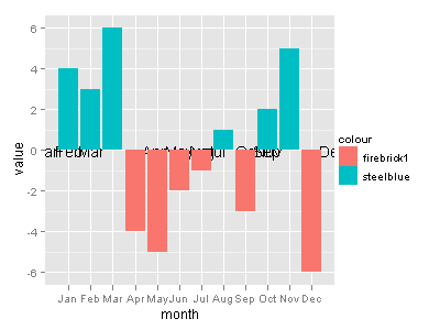
First try to plot the data, using the default formatting options.
> ggplot(dtm, aes(month, value, label = month,
     hjust = hjust)) + geom_text(aes(y = 0,
     colour = colour)) + geom_bar(stat = "identity",
     aes(fill = colour))
|
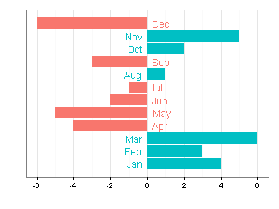
There are a few problems with this chart that need to be fixed: we flip the x & y axes, remove axes labels and change the colour theme.
> last_plot() + coord_flip() + labs(x = "", y = "") +
     scale_x_discrete(breaks = NA) + theme_bw() +
     opts(legend.position = "none")
|


Is there a way to make sure that the coord_flip() order has the graph stay in order (from Jan. to Dec. from top to bottom?) Almost a coord_flip and then a reorder?
If the tick labels/categories are entire words, ggplot seems to forget that jagged alignment of these labels on the x-axis is not very aesthetically pleasing (rotating the text using opt worsens the problem) — so coord_flip() achieves alignment (which is naturally found with base boxplot in r) when the words are on the y-axis. However, is there an option to reorder either the factors or the categories from top to bottom if one wished to show a time trend in that direction?
The ordering of categories on the plot depends on the order of levels of factor(dtm$month)
If you reverse the order, the categories in all the plots will be reversed as well.
dtm$month <- factor(dtm$month, levels = rev(month.abb))
In case other people run into this question too, the firebrick and steel blue do not actually specify the color they are instead serving as a factor that ggplot uses when deciding how to fill the bars. You can change the values and name of the aforementioned “coulour” to anything you want. In my case, I set them to be the two names of the species that I was comparing. This will also update the legend. If you want to change the color of the bars you can use the following:
+ scale_fill_manual(values = c(“#02C964”, “#4CB0E0”)) # where you specify any color combination that matches the number of factors uses by fill.