Consultants’ Chart in ggplot2
Excel Charts Blog posted a video tutorial of how to create a circumplex or rose or dougnut chart in Excel. Apparently this type of chart is very popular in the consulting industry, hence the “Consultants’ Chart”.

It is very easy to make this chart in Excel 2010, but it involves countless number of clicks and formulas to format both the source data and the chart itself.
In ggplot2 the same can be achieved with around 10 lines of code, as can be seen below.
Set up dummy dataframe
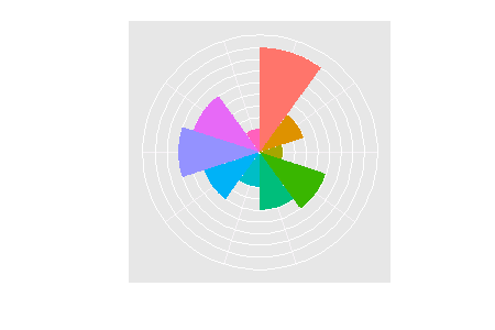
> set.seed(9876) > DF <- data.frame(variable = 1:10, value = sample(10, + replace = TRUE)) > DF variable value 1 1 9 2 2 4 3 3 2 4 4 6 5 5 5 6 6 3 7 7 5 8 8 7 9 9 6 10 10 2 |
Prepare the charts
> library(ggplot2) |
Dougnut chart is essentially a bar chart using a polar coordinate system, so we start off with a simple bar chart. And to make life a bit more colourful will fill each slice with a different colour.
> ggplot(DF, aes(factor(variable), value, fill = factor(variable))) + + geom_bar(width = 1) |

Next the coordinate system is changed and some of the plot elements are removed for a cleaner look.
> last_plot() + scale_y_continuous(breaks = 0:10) + + coord_polar() + labs(x = "", y = "") + opts(legend.position = "none", + axis.text.x = theme_blank(), axis.text.y = theme_blank(), + axis.ticks = theme_blank()) |
Adding gridlines
Update 17 August 2010
Several commentators asked how to draw gridlines on top of the slices as in the original example.
Putting the gridlines/guides on top of the plot is accomplished by adding a new variable that is purely used for drawing the borders of each slice element. Essentially, it stacks the required number of slices with a white border on top of each other.
> DF <- ddply(DF, .(variable), transform, border = rep(1, + value)) > head(DF, 10) variable value border 1 1 9 1 2 1 9 1 3 1 9 1 4 1 9 1 5 1 9 1 6 1 9 1 7 1 9 1 8 1 9 1 9 1 9 1 10 2 4 1 |
> ggplot(DF, aes(factor(variable))) + geom_bar(width = 1, + aes(y = value, fill = factor(variable))) + + geom_bar(aes(y = border, width = 1), position = "stack", + stat = "identity", fill = NA, colour = "white") + + scale_y_continuous(breaks = 0:10) + coord_polar() + + labs(x = "", y = "") + opts(legend.position = "none", + axis.text.x = theme_blank(), axis.text.y = theme_blank(), + axis.ticks = theme_blank()) |

Trackbacks
- Rose plot using Deducers ggplot2 plot builder | R-statistics blog
- Bookmarks for August 22nd from 10:59 to 11:26 | dekay.org
- Rose plot using Deducers ggplot2 plot builder | sumber referensi statistika
- 10 reasons to switch to ggplot | Mandy Mejia
- 10 reasons to switch to ggplot | Mandy Mejia
- Applied Coxcombs: The Quality of Democracy | pointedanalytics


Nice explanation on the ‘how’, but I’m not sure under what circumstances one would need the ‘consultant plot’. What advantage does this visualization have over the simple bar chart?
My main idea was to show how easy it is to create such a plot in ggplot, compared to Excel.
I also agree with you that more often than not a simple bar chart conveys the same message more efficiently.
ggplot might be too easy to make very pleasing eye candy! Often I find myself getting carried away with the aesthetics.
Although I have never used it, I can imagine this plot having a couple of advantages:
– Novelty. Although it sounds superficial, getting people’s attention with a graph that is difficult to reproduce could be useful for a consultant.
– The scale also could be an advantage because it draws attention to different data groups differently than a bar chart. Because of the distortion introduced by the circle, the difference between 7 and 8 in the above chart is a bigger difference than the difference between 2 and 3. This would be good in situations where you only want to focus on the top couple of issues.
– Neutral layout. The circle implies something about the data not having an order, and therefore not implying importance through that order.
This plot is actually useful in visualizing quantities that have a strong directional dependence. Meteorological data for instance. Plotting average wind speeds, for example show the prevailing wind direction quite intuitively.
Nice example of the ease of using ggplot . . . but I can think of so many reasons NOT to make this type of chart. And the original article this refers to makes it clear that the people who make them don’t think they’re good charts either. Let us all hope we never have to intentionally make bad graphics instead of good ones in order to justify our existence (but if we had to do it, we can at least use ggplot).
Thanks for your ggplot example, I use these sometimes. How would you show the gray polar lines on top of the colour slices (like the Excel graph)?
I updated the post showing how to do this.
Nice. It can be made even easier with the new ggplot2 GUI included in the latest version of Deducer. After the template is made, the plot can be generated with 4 clicks of the mouse. I just made a quick video tutorial: http://www.youtube.com/watch?v=CHYATHLM5sY
The generated template file is available at: http://neolab.stat.ucla.edu/cranstats/rose.ggtmpl
more info about deducer is available at: http://www.deducer.org
Really cool post, thank you for it!
Following your post, Ian Fellows wrote a way for reproducing your coding using the deducer R GUI, here is the code and a video tutorial of it:
http://www.r-statistics.com/2010/08/rose-plot-using-deducers-ggplot2-plot-builder/
Best,
Tal
Thanks Tal,
I tried to post a reference to that here, but it kept harping about a repeat comment. I’m the web 2.0 equivalent of a 90 year old grandma
The original example had the grid lines on top of the polygons. Do you know of a way to do this in ggplot2?
See the updated post.
OMG! I can’t believe I just found this website (via a rabbit hole from Deducer). Great tutorials, exactly what I need to sharpen my R skills.
Thanks!!!
You can do something similar with the webvis package with this command:
pv.wedge(data=data.frame(y=rep(1, 10), rad=10*(DF$value)), outer.radius.name="rad", angle.name="y", render=TRUE).Actually, here’s a simpler version with the same result:
plot.webvis(x=10*(DF$value), y=rep(1, 10), outer.radius.name="x", type="pie")this is awesome. when do you use this kind of chart. how to add text and graph legend?
I have turned off the legend, you can add one by uncommenting 0pts(legend.position = “none”). Where would you like to add text?
This is fabulous; Was the plot at the begining of the article produced using R (or was it produced using Excel?)
If it is produced using R, how would you make the necessary gaps (and lines) in R?
For some picky reasons, I would like the plot to appear exactly like your first plot.
Many Thanks,
Athula.
Yes, you could make the gridlines thicker in ggplot2, I presume this would make you graph closer in appearance to the original.
One problem with this chart is the scale, which overemphasises large values. Take for example the first wedge (value 9) and the sixth (value 3). The area of the first wedge is nine times the sixth wedge, rather than three times.
To get an honest picture of areas, the radius of each wedge needs to be proportional to the square-root of the value. The same is true for the circular gridlines.
Hey there! Nice chart!
It’s also possible to use geom_hline and geom_vline to make the grid lines, no? Depending on the number of gridlines, this might be the easier approach.
I think you are right, although I have not tried.
Here’s my take on the same subject – I adapted your code to facet across several charts…
http://grrrraphics.blogspot.se/2012/05/my-take-on-polar-bar-aka-consultants.html
Hi there,
the same can be done with just one geom_bar()
ggplot(DF, aes(factor(variable))) +
geom_bar(aes(y = border, width = 1, fill = factor(variable)), position = “stack”, stat = “identity”, colour = “white”) +
scale_y_continuous(breaks = 0:10) + labs(x = “”, y = “”) +
theme(legend.position = “none”, axis.text.y = element_blank(), axis.ticks = element_blank())
Isn’t this – or at least soemthing very like it – traditionally known as a coxcomb plot, of the type Florence Nightingale used to display crimea war deaths? (See http://understandinguncertainty.org/coxcombs)
How would you go about adding a hole in the middle like the original chart? So that the data doesn’t start in the very center?