New Features in ggplot2 version 0.8.5
Just before Christmas ggplot2 version 0.8.5 was released, closely following the release of version 0.8.4 a week or so earlier. Whilst both versions included included numerous bugfixes (25 in 0.8.4 and 17 in 0.8.5), the latest version also incorporated some new features.
As ggplot2 is all about graphical display, so I went through the list of new features and below is a visual example of each new feature, plotted most often utilising the code examples included in the respective bugtracker issues.
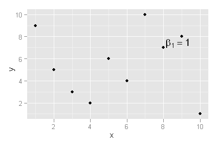
1)geom_text gains parse argument which makes it possible to display expressions
> library(ggplot2) |
> set.seed(1)
> mydata <- data.frame(x = sample(10), y = sample(10))
> ggplot(mydata, aes(x, y)) + geom_point() + annotate("text",
+     x = mydata[6, 1], y = mydata[6, 2], label = "beta[1] == 1",
+     parse = T, vjust = 0, hjust = -0.1)
|
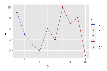
2) all scales now have legend parameter, which defaults to TRUE. Setting to false will prevent that scale from contributing to the legend.
> ggplot(mydata, aes(x, y, colour = x)) + geom_point(legend = FALSE) + + geom_line() |
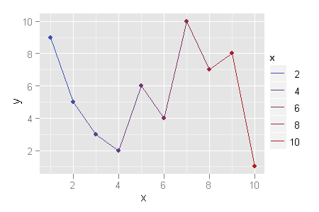
In previous version the legend of the above plot looked like this and there was now way to change this.
> ggplot(mydata, aes(x, y, colour = x)) + geom_point() + + geom_line() |
3) default axis labels and legend titles are now stored in the options, instead of in each scale.
This allows to specify them using the opts call.
> p <- ggplot(mtcars, aes(cyl, mpg, colour = cyl)) + + geom_point() > p + opts(labels = c(x = "Cylinders", y = "Miles per gallon", + colour = "Colour")) |
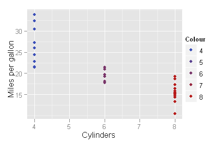
The other options to set labels exist as previously:
> p + labs(x = "Cylinders")
> p + xlab("Cylinders")
> p + scale_colour_gradient(name = "Colour")
|
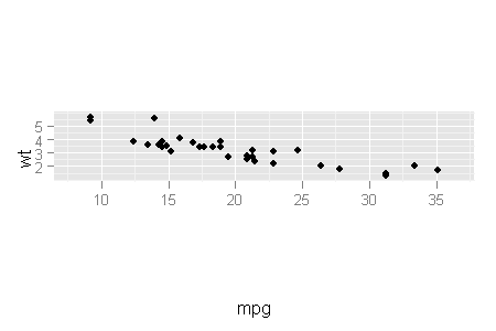
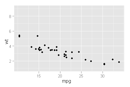
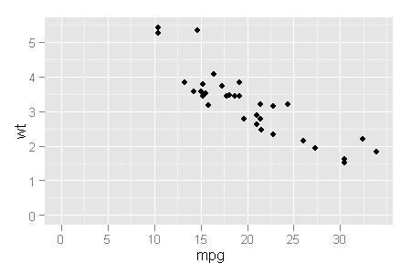
4) coord_equal: when ratio = NULL (the default), it will adjust the aspect ratio of the plot, rather than trying to extend the shortest axis.
> qplot(mpg, wt, data = mtcars) + coord_equal() |
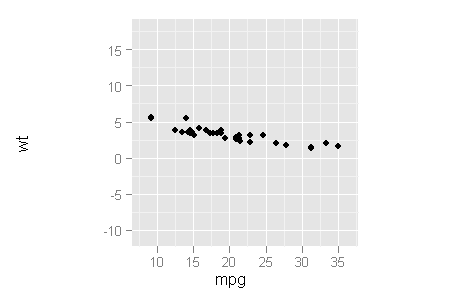
This is what the default looked like in the previous version, and it was impossible to generate the plot above.
> qplot(mpg, wt, data = mtcars) + coord_equal(ratio = 1) |
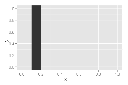
5) x and y positions can be set to Inf or -Inf to refer to the top/right and bottom/left extents of the panel.
This is useful for annotations, and for geom_rect, geom_vline and geom_hline.
> ggplot(data.frame(x = 0:1, y = 0:1)) + geom_rect(aes(x = x, + y = y), xmin = 0.1, xmax = 0.2, ymin = -Inf, + ymax = Inf) |
6)expand_limits(): a new function to make it easy to force the inclusion of any set of values in the limits of any aesthetic.
> p <- qplot(mpg, wt, data = mtcars) |
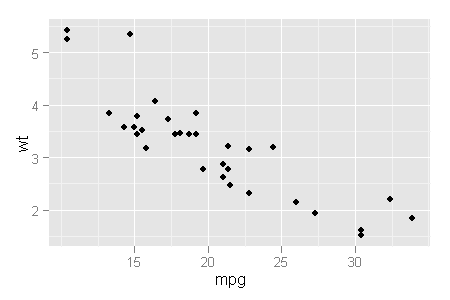
> p + expand_limits(x = 0) |
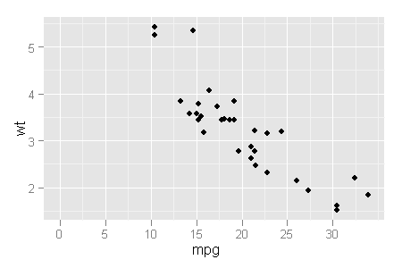
> p + expand_limits(y = c(1, 9)) |
is the equivalent of
> p + ylim(c(1, 9)) |
> p + expand_limits(x = 0, y = 0) |
It would be good if similar functionality could be extended to xlim, so that the following would work. This way the setting of limits would be encapsulated in one function (xlim/ylim).
> p + xlim(0, Inf) |


Nice summary – thanks!
Hi.
My charting needs are mostly x-multple Y value line or dot chart doing system performance analysis.
Most tools like iostat, vmstat deals with one x-axis (time or counter) with many y-values.
With lattice, I can easily do “dotplot( y1+y2+y3+y4+y5 ~ x, ” style plot.
But with ggplot2, it is not so easy after all and I am still struggling.
Is there an easy way to do such plotting?
Thank you very much.
You would just need to
The following example should get you started –
library(ggplot2)df <- data.frame(y1 = sample(10), y2 = sample(10), x = sample(10))
df1 <- melt(df, id.vars="x")
qplot(x, value, data = df1, colour = variable)
Wow. Thanks for introducing “melt” function. That was immensely useful for me.
Great summary!