This is the second post in a series attempting to recreate the figures in Lattice: Multivariate Data Visualization with R (R code) with ggplot2.
Chapter 2 – A Technical Overview of lattice
Topics covered:
- The formula interface
- object dimensions and physical layout
- Annotation
- Scales and Axes
- Panel functions
Figure 2.1
> library(lattice)
> library(ggplot2)
> data(Oats, package = "MEMSS")
|
lattice
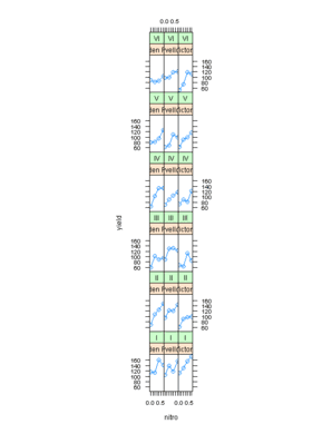
> tp1.oats <- xyplot(yield ~ nitro | Variety + Block, data = Oats,
+     type = "o")
> print(tp1.oats)
|
ggplot2
> pg.oats <- ggplot(Oats, aes(nitro, yield)) + geom_line() +
+     geom_point() + facet_wrap(~Block + Variety, ncol = 3)
> print(pg.oats)
|


Figure 2.2
lattice
ggplot2
> pg <- pg.oats %+% subset(Oats, Block == "I")
> print(pg)
|


Figure 2.3
lattice
> pl <- update(tp1.oats, aspect = "xy")
> print(pl)
|
ggplot2
> pg <- pg.oats + opts(panel.margin = unit(0, "lines"))
> print(pg)
|
| Note |
Currently it is not possible to manipulate the facet aspect ratio. A workaround is to tweak the output image dimensions when saving the output graph to a file. |
| Note |
ggplot2 orders facets in the opposite direction compared to lattice. |


Figure 2.4
lattice
> pl <- update(tp1.oats, aspect = "xy", layout = c(0, 18))
> print(pl)
|
ggplot2
> pg <- pg.oats + facet_wrap(~Block + Variety, ncol = 6)
> print(pg)
|


Figure 2.5
lattice
> pl <- update(tp1.oats, aspect = "xy", layout = c(0, 18),
+     between = list(x = c(0, 0, 0.5), y = 0.5))
> print(pl)
|
ggplot2
Grouping of individual facets not possible in ggplot2.
|

Figure 2.6
lattice
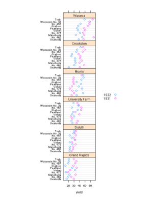
> pl <- dotplot(variety ~ yield | site, barley, layout = c(1,
+     6), aspect = c(0.7), groups = year, auto.key = list(space = "right"))
> print(pl)
|
ggplot2
> pg <- ggplot(barley, aes(yield, variety, colour = year)) +
+     geom_point() + facet_wrap(~site, ncol = 1)
> print(pg)
|
| Note |
Currently it is not possible to manipulate the facet aspect ratio. A workaround is to tweak the output image dimensions when saving the output graph to a file. |


Figure 2.7
lattice
> key.variety <- list(space = "right", text = list(levels(Oats$Variety)),
+     points = list(pch = 1:3, col = "black"))
> pl <- xyplot(yield ~ nitro | Block, Oats, aspect = "xy",
+     type = "o", groups = Variety, key = key.variety,
+     lty = 1, pch = 1:3, col.line = "darkgrey", col.symbol = "black",
+     xlab = "Nitrogen concentration (cwt/acre)", ylab = "Yield (bushels/acre)",
+     main = "Yield of three varieties of oats", sub = "A 3 x 4 split plot experiment with 6 blocks")
> print(pl)
|
ggplot2
> p <- ggplot(Oats, aes(nitro, yield, group = Variety,
+     shape = Variety))
> pg <- p + geom_line(colour = "darkgrey") + geom_point() +
+     facet_grid(~Block) + scale_x_continuous(breaks = seq(0,
+     0.6, by = 0.2), labels = seq(0, 0.6, by = 0.2)) +
+     opts(title = "Yield of three varieties of oats") +
+     labs(x = "Nitrogen concentration (cwt/acre) \n A 3 x 4 split plot experiment with 6 blocks",
+         y = "Yield (bushels/acre)")
> print(pg)
|
| Note |
ggplot2 does not have the subtitle functionality. Nevertheless, very similar result can be achieved by splitting the x-axis label into two rows. |
| Note |
scale_x_continuous() is used to manually set the axis breaks and labels. Otherwise these would be illegible like on Figures 2.3 & 2.4 above. |


Figure 2.8
lattice
> pl <- barchart(Class ~ Freq | Sex + Age, data = as.data.frame(Titanic),
+     groups = Survived, stack = TRUE, layout = c(4, 1),
+     auto.key = list(title = "Survived", columns = 2))
> print(pl)
|
ggplot2
> p <- ggplot(as.data.frame(Titanic), aes(Class, Freq,
+     fill = Survived))
> pg.titanic <- p + geom_bar(stat = "identity") + facet_wrap(~Age +
+     Sex, nrow = 1) + coord_flip()
> print(pg.titanic)
|
| Note |
Currently it is not possible to manipulate the facet aspect ratio. A workaround is to tweak the output image dimensions when saving the output graph to a file. |


Figure 2.9
lattice
> pl <- barchart(Class ~ Freq | Sex + Age, data = as.data.frame(Titanic),
+     groups = Survived, stack = TRUE, layout = c(4, 1),
+     auto.key = list(title = "Survived", columns = 2),
+     scales = list(x = "free"))
> print(pl)
|
ggplot2
> pg <- pg.titanic + facet_wrap(~Age + Sex, nrow = 1, scales = "free")
> print(pg)
|
| Note |
Currently it is not possible to manipulate the facet aspect ratio. A workaround is to tweak the output image dimensions when saving the output graph to a file. |


Hello
How can you create a gap on the y axis? Something like the result produced by gap.plot in plotrix but with lattice or ggplot?