ggplot2 Version of Figures in “Lattice: Multivariate Data Visualization with R” (Part 4)
July 2, 2009
This is the fourth post in a series attempting to recreate the figures in Lattice: Multivariate Data Visualization with R (R code) with ggplot2.
Chapter 4 – Displaying Multiway Tables
Topics covered:
- Cleveland dot plot
- Bar chart
- Reordering factor levels
Figure 4.1
> library(lattice) > library(ggplot2) |
> data(VADeaths) |
lattice
> pl <- dotplot(VADeaths, groups = FALSE) > print(pl) |
ggplot2
> pg <- ggplot(melt(VADeaths), aes(value, X1)) + geom_point() +
+     facet_wrap(~X2) + ylab("")
> print(pg)
|


Figure 4.2
lattice
> pl <- dotplot(VADeaths, groups = FALSE, layout = c(1,
+     4), aspect = 0.7, origin = 0, type = c("p", "h"),
+     main = "Death Rates in Virginia - 1940", xlab = "Rate (per 1000)")
> print(pl)
|
ggplot2
> p <- ggplot(melt(VADeaths), aes(x = 0, xend = value, + y = X1, yend = X1)) > pg <- p + geom_point(aes(value, X1)) + geom_segment() + + facet_wrap(~X2, ncol = 1) + labs(x = "Rate (per 1000)", + y = "") + opts(title = "Death Rates in Virginia - 1940") > print(pg) |
| Note | When using facet_wrap() it is not possible to manipulate the aspect ratio of facets. A workaround is to tweak the output image dimensions when saving the output graph to a file. |


Figure 4.3
lattice
> pl <- dotplot(VADeaths, type = "o", auto.key = list(lines = TRUE, + space = "right"), main = "Death Rates in Virginia - 1940", + xlab = "Rate (per 1000)") > print(pl) |
ggplot2
> p <- ggplot(melt(VADeaths), aes(value, X1, colour = X2,
+     group = X2))
> pg <- p + geom_point() + geom_line() + xlab("Rate (per 1000)") +
+     ylab("") + opts(title = "Death Rates in Virginia - 1940")
> print(pg)
|


Figure 4.4
lattice
> pl <- barchart(VADeaths, groups = FALSE, layout = c(1, + 4), aspect = 0.7, reference = FALSE, main = "Death Rates in Virginia - 1940", + xlab = "Rate (per 100)") > print(pl) |
ggplot2
> p <- ggplot(melt(VADeaths), aes(X1, value))
> pg <- p + geom_bar(stat = "identity") + facet_wrap(~X2,
+     ncol = 1) + coord_flip() + xlab("") + ylab("Rate (per 1000)") +
+     opts(title = "Death Rates in Virginia - 1940")
> print(pg)
|
| Note | When using facet_wrap() it is not possible to manipulate the aspect ratio of facets. A workaround is to tweak the output image dimensions when saving the output graph to a file. |


Figure 4.5
> data(postdoc, package = "latticeExtra") |
lattice
> pl <- barchart(prop.table(postdoc, margin = 1), xlab = "Proportion", + auto.key = list(adj = 1)) > print(pl) |
ggplot2
> pg <- ggplot(as.data.frame(postdoc), aes(Field, Freq, + fill = Reason)) + geom_bar(position = "fill") + coord_flip() + + scale_x_discrete(formatter = "abbreviate") > print(pg) |

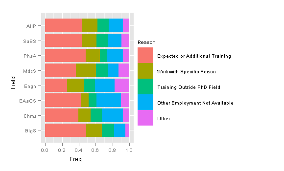
Figure 4.6
lattice
> pl <- dotplot(prop.table(postdoc, margin = 1), groups = FALSE, + xlab = "Proportion", par.strip.text = list(abbreviate = TRUE, + minlength = 10)) > print(pl) |
ggplot2
> postdoc.df <- as.data.frame(prop.table(postdoc, margin = 1), + stringsAsFactors = FALSE) > postdoc.df$Reason <- abbreviate(postdoc.df$Reason, minlength = 10) |
> pg <- ggplot(postdoc.df, aes(Freq, Field)) + geom_point() +
+     facet_wrap(~Reason) + xlab("Proportion") + ylab("")
> print(pg)
|


Figure 4.7
lattice
> pl <- dotplot(prop.table(postdoc, margin = 1), groups = FALSE,
+     index.cond = function(x, y) median(x), xlab = "Proportion",
+     layout = c(1, 5), aspect = 0.6, scales = list(y = list(relation = "free",
+         rot = 0)), prepanel = function(x, y) {
+         list(ylim = levels(reorder(y, x)))
+     }, panel = function(x, y, ...) {
+         panel.dotplot(x, reorder(y, x), ...)
+     })
> print(pl)
|
ggplot2
Sorting each facets separately is not possible in ggplot2. |

Figure 4.8
> data(Chem97, package = "mlmRev") |
lattice
> gcsescore.tab <- xtabs(~gcsescore + gender, Chem97) > gcsescore.df <- as.data.frame(gcsescore.tab) > gcsescore.df$gcsescore <- as.numeric(as.character(gcsescore.df$gcsescore)) |
> pl <- xyplot(Freq ~ gcsescore | gender, data = gcsescore.df, + type = "h", layout = c(1, 2), xlab = "Average GCSE Score") > print(pl) |
ggplot2
> pg <- ggplot(Chem97, aes(gcsescore)) + geom_linerange(aes(ymin = 0,
+     ymax = ..count..), stat = "bin", binwidth = 0.005) +
+     facet_wrap(~gender, ncol = 1) + xlab("Average GCSE Score") +
+     ylab("")
> print(pg)
|


Figure 4.9
lattice
> score.tab <- xtabs(~score + gender, Chem97) > score.df <- as.data.frame(score.tab) |
> pl <- barchart(Freq ~ score | gender, score.df, origin = 0) > print(pl) |
ggplot2
> pg <- ggplot(Chem97, aes(factor(score))) + geom_bar(aes(y = ..count..),
+     stat = "bin") + facet_grid(. ~ gender) + xlab("")
> print(pg)
|


6 Comments
leave one →
Trackbacks
- ggplot2 Version of Figures in “Lattice: Multivariate Data Visualization with R” (Part 5) « Learning R
- ggplot2 Version of Figures in “Lattice: Multivariate Data Visualization with R” (Part 6) « Learning R
- ggplot2 Version of Figures in “Lattice: Multivariate Data Visualization with R” (Part 10) « Learning R
- datanalytics » Diagramas de puntos (dotplots)


For Figure 4.5, is there any way to center a label on each of the bars with the percentage?
I suggest you calculate the percentages from the raw data, and then place them on the bars using
geom_text().