This is the 8th post in a series attempting to recreate the figures in Lattice: Multivariate Data Visualization with R (R code available here) with ggplot2.
Previous parts in this series: Part 1, Part 2, Part 3, Part 4, Part 5, Part 6, Part 7.
Chapter 8 – Plot Coordinates and Axis Annotation
Topics covered:
- Packets
- The prepanel function, axis limits, and aspect ratio
- Axis annotation
- The scales argument
Figure 8.1
> library(lattice)
> library(ggplot2)
|
lattice
> pl <- stripplot(depth ~ factor(mag), data = quakes, jitter.data = TRUE,
+     scales = list(y = "free", rot = 0), prepanel = function(x,
+         y, ...) list(ylim = rev(range(y))), xlab = "Magnitude (Richter scale)")
> print(pl)
|
ggplot2
> p <- ggplot(quakes, aes(factor(mag), depth))
> pg <- p + geom_point(position = position_jitter(width = 0.15),
+     alpha = 0.6, shape = 1) + xlab("Magnitude (Richter)") +
+     ylab("Depth (km)") + theme_bw() + scale_y_reverse()
> print(pg)
|
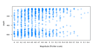

| Note |
Compare to Figure 3.16. Y-Axes reversed. |
Figure 8.2
> data(biocAccess, package = "latticeExtra")
|
lattice
> pl <- xyplot(counts/1000 ~ time | equal.count(as.numeric(time),
+     9, overlap = 0.1), biocAccess, type = "l", aspect = "xy",
+     strip = FALSE, ylab = "Numer of accesses (thousands)",
+     xlab = "", scales = list(x = list(relation = "sliced",
+         axs = "i"), y = list(alternating = FALSE)))
> print(pl)
|
ggplot2
> fn <- function(data = quakes$mag, number = 4, ...) {
+     intrv <<- as.data.frame(co.intervals(data, number,
+         ...))
+     mag <- sort(unique(data))
+     intervals <- ldply(mag, function(x) {
+         t(as.numeric(x < intrv$V2 & x > intrv$V1))
+     })
+     tmp <- melt(cbind(mag, intervals), id.var = 1)
+     tmp[tmp$value > 0, 1:2]
+ }
> biocAccess <- merge(biocAccess[, c("time", "counts")],
+     fn(data = as.numeric(biocAccess$time), number = 9,
+         overlap = 0.1), by.x = "time", by.y = "mag")
|
| Note |
Using custom function fn(), first defined in Figure 5.5. |
> pg <- ggplot(biocAccess, aes(time, counts/1000)) + geom_line() +
+     facet_wrap(~variable, scales = "free_x", ncol = 1) +
+     ylab("Numer of accesses (thousands)") + xlab("") +
+     opts(strip.background = theme_blank(), strip.text.x = theme_blank()) +
+     opts(panel.margin = unit(-0.25, "lines"))
> print(pg)
|

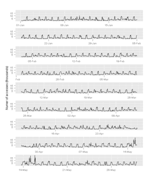
Figure 8.3
> data(Earthquake, package = "MEMSS")
|
lattice
> pl <- xyplot(accel ~ distance, data = Earthquake, prepanel = prepanel.loess,
+     aspect = "xy", type = c("p", "g", "smooth"), scales = list(log = 2),
+     xlab = "Distance From Epicenter (km)", ylab = "Maximum Horizontal Acceleration (g)")
> print(pl)
|
ggplot2
> pg <- ggplot(Earthquake, aes(distance, accel)) + geom_point() +
+     geom_smooth(method = "loess", se = FALSE) + scale_x_log2() +
+     scale_y_log2() + xlab("Distance From Epicenter (km)") +
+     ylab("Maximum Horizontal Acceleration (g)")
> print(pg)
|
| Note |
ggplot2 doesn’t have the equivalent of aspect="xy" in lattice, which “tries to compute the aspect based on the 45 degree banking rule”. |
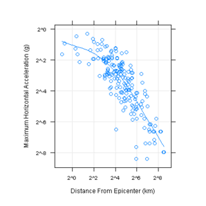

Figure 8.4
lattice
> yscale.components.log2 <- function(...) {
+     ans <- yscale.components.default(...)
+     ans$right <- ans$left
+     ans$left$labels$labels <- parse(text = ans$left$labels$labels)
+     ans$right$labels$labels <- MASS::fractions(2^(ans$right$labels$at))
+     ans
+ }
> logTicks <- function(lim, loc = c(1, 5)) {
+     ii <- floor(log10(range(lim))) + c(-1, 2)
+     main <- 10^(ii[1]:ii[2])
+     r <- as.numeric(outer(loc, main, "*"))
+     r[lim[1] <= r & r <= lim[2]]
+ }
> xscale.components.log2 <- function(lim, ...) {
+     ans <- xscale.components.default(lim = lim, ...)
+     tick.at <- logTicks(2^lim, loc = c(1, 3))
+     ans$bottom$ticks$at <- log(tick.at, 2)
+     ans$bottom$labels$at <- log(tick.at, 2)
+     ans$bottom$labels$labels <- as.character(tick.at)
+     ans
+ }
|
> pl <- xyplot(accel ~ distance | cut(Richter, c(4.9, 5.5,
+     6.5, 7.8)), data = Earthquake, type = c("p", "g"),
+     scales = list(log = 2, y = list(alternating = 3)),
+     xlab = "Distance From Epicenter (km)", ylab = "Maximum Horizontal Acceleration (g)",
+     xscale.components = xscale.components.log2, yscale.components = yscale.components.log2)
> print(pl)
|
ggplot2
> Earthquake$magnitude <- cut(Earthquake$Richter, c(4.9,
+     5.5, 6.5, 7.8))
> ticks <- logTicks(range(Earthquake$distance), loc = c(1,
+     3))
> pg <- ggplot(Earthquake, aes(distance, accel)) + geom_point() +
+     facet_grid(~magnitude) + scale_y_log2() + scale_x_log2(breaks = ticks,
+     labels = ticks) + xlab("Distance From Epicenter (km)") +
+     ylab("Maximum Horizontal Acceleration (g)")
> print(pg)
|
| Note |
ggplot2 does not support the addition of a secondary axes. |


Figure 8.5
> xscale.components.log10 <- function(lim, ...) {
+     ans <- xscale.components.default(lim = lim, ...)
+     tick.at <- logTicks(10^lim, loc = 1:9)
+     tick.at.major <- logTicks(10^lim, loc = 1)
+     major <- tick.at %in% tick.at.major
+     ans$bottom$ticks$at <- log(tick.at, 10)
+     ans$bottom$ticks$tck <- ifelse(major, 1.5, 0.75)
+     ans$bottom$labels$at <- log(tick.at, 10)
+     ans$bottom$labels$labels <- as.character(tick.at)
+     ans$bottom$labels$labels[!major] <- ""
+     ans$bottom$labels$check.overlap <- FALSE
+     ans
+ }
|
lattice
> pl <- xyplot(accel ~ distance, data = Earthquake, prepanel = prepanel.loess,
+     aspect = "xy", type = c("p", "g"), scales = list(log = 10),
+     xlab = "Distance From Epicenter (km)", ylab = "Maximum Horizontal Acceleration (g)",
+     xscale.components = xscale.components.log10)
> print(pl)
|
ggplot2
> ticks <- logTicks(range(Earthquake$distance), loc = c(1,
+     10))
> pg <- ggplot(Earthquake, aes(distance, accel)) + geom_point() +
+     scale_y_log10() + scale_x_log10(breaks = ticks, labels = ticks) +
+     xlab("Distance From Epicenter (km)") + ylab("Maximum Horizontal Acceleration (g)")
> print(pg)
|
| Note |
ggplot2 doesn’t have the equivalent of aspect="xy" in lattice, which “tries to compute the aspect based on the 45 degree banking rule”. |


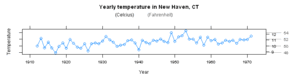
Figure 8.6
lattice
> axis.CF <- function(side, ...) {
+     if (side == "right") {
+         F2C <- function(f) 5 * (f - 32)/9
+         C2F <- function(c) 32 + 9 * c/5
+         ylim <- current.panel.limits()$ylim
+         prettyF <- pretty(ylim)
+         prettyC <- pretty(F2C(ylim))
+         panel.axis(side = side, outside = TRUE, at = prettyF,
+             tck = 5, line.col = "grey65", text.col = "grey35")
+         panel.axis(side = side, outside = TRUE, at = C2F(prettyC),
+             labels = as.character(prettyC), tck = 1,
+             line.col = "black", text.col = "black")
+     }
+     else axis.default(side = side, ...)
+ }
|
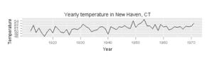
> pl <- xyplot(nhtemp ~ time(nhtemp), aspect = "xy", type = "o",
+     scales = list(y = list(alternating = 2, tck = c(1,
+         5))), axis = axis.CF, xlab = "Year", ylab = "Temperature",
+     main = "Yearly temperature in New Haven, CT", key = list(text = list(c("(Celcius)",
+         "(Fahrenheit)"), col = c("black", "grey35")),
+         columns = 2))
> print(pl)
|
ggplot2
> temp <- data.frame(nhtemp)
> temp$year <- seq(1912, 1971)
> pg <- ggplot(temp, aes(year, nhtemp)) + geom_line() +
+     xlab("Year") + ylab("Temperature") + opts(title = "Yearly temperature in New Haven, CT")
> print(pg)
|
| Note |
ggplot2 doesn’t support the addition of secondary axes. |


Hi,
I’ve been enjoying your lattics vs. ggplot2 posts. After having done these comparisons for a while now, I’m curious if you have any suggestions as to which graphics system someone should pickup, or what you like better in one vs. the other.
Perhaps it might make for a good blog post 😉
Thanks,
-steve
Steve, I plan to make a post on this very subject once I have completed all the chapters.
@learnr – thank you for your blog. Looking forward to read your “verdict” on ggplot2 and lattice. When that time comes, I would also be interested in your experience pure performance wise. I feel that ggplot2 is quite a bit slower than base graphics. I have no experience with lattice – but if lattice is as fast as base then that might convince me.
Thanks again.
Did you do that post yet? I prefer ggplot 2 — but I never really learned lattice. I like Hadley’s approach and I believe Grammar of Graphics has more depth / inherent power.
Yes, I wrote a summary post on the lattice-ggplot2.
@Andreas —
I wrote to Hadley Wickham about this earlier this summer,
and his response was:
“So far I have been completely focused on functionality,
and not at all on speed. I would really like to spend some time profiling and optimised ggplot2 (I suspect an order of magnitude speed increase would be possible), but unfortunately my summer is filling up rapidly and I’m feeling some pressure to write papers rather than (more) code.”
My impression is that lattice is a little bit slower than
base graphics, but much faster than ggplot2 (which is
still quite earlier in its development cycle).
Don’t forget to factor in user time vs. computer time …