ggplot2 Version of Figures in “Lattice: Multivariate Data Visualization with R” (Part 10)
This is the 10th post in a series attempting to recreate the figures in Lattice: Multivariate Data Visualization with R (R code available here) with ggplot2.
Previous parts in this series: Part 1, Part 2, Part 3, Part 4, Part 5, Part 6, Part 7, Part 8, Part 9.
Chapter 10 – Data Manipulation and Related Topics
Topics covered:
- Non-standard evaluation in the context of lattice
- The extended formula interface
- Combining data sources, subsetting
- Shingles
- Ordering levels of categorical variables
- Controlling the appearance of strips
Figure 10.1
> library(lattice) > library(ggplot2) |
> Titanic1 <- as.data.frame(as.table(Titanic[, , "Adult", + ])) |
lattice
> pl <- barchart(Class ~ Freq | Sex, Titanic1, groups = Survived, + stack = TRUE, auto.key = list(title = "Survived", + columns = 2)) > print(pl) |
ggplot2
> pg <- ggplot(Titanic1, aes(Class, Freq, fill = Survived)) + + geom_bar(stat = "identity") + coord_flip() + facet_grid(~Sex) > print(pg) |


Figure 10.2
lattice
> Titanic2 <- reshape(Titanic1, direction = "wide", v.names = "Freq",
+     idvar = c("Class", "Sex"), timevar = "Survived")
> names(Titanic2) <- c("Class", "Sex", "Dead", "Alive")
|
> pl <- barchart(Class ~ Dead + Alive | Sex, Titanic2, + stack = TRUE, auto.key = list(columns = 2)) > print(pl) |
ggplot2
> pg <- ggplot(Titanic1, aes(Class, Freq, fill = Survived)) +
+     geom_bar(stat = "identity") + coord_flip() + facet_grid(~Sex) +
+     scale_fill_discrete("", labels = c("Dead", "Alive"))
> print(pg)
|

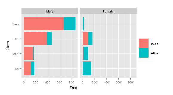
Figure 10.3
> data(Gcsemv, package = "mlmRev") |
lattice
> pl <- xyplot(written ~ course | gender, data = Gcsemv,
+     type = c("g", "p", "smooth"), xlab = "Coursework score",
+     ylab = "Written exam score", panel = function(x,
+         y, ...) {
+         panel.xyplot(x, y, ...)
+         panel.rug(x = x[is.na(y)], y = y[is.na(x)])
+     })
> print(pl)
|
ggplot2
> pg <- ggplot(Gcsemv, aes(course, written)) + geom_point() +
+     geom_smooth(method = "loess", se = F) + geom_rug() +
+     facet_grid(~gender) + xlab("Coursework score") +
+     ylab("Written exam score")
> print(pg)
|


Figure 10.4
lattice
> pl <- qqmath(~written + course, Gcsemv, type = c("p",
+     "g"), outer = TRUE, groups = gender, auto.key = list(columns = 2),
+     f.value = ppoints(200), ylab = "Score")
> print(pl)
|
ggplot2
> pg <- ggplot(melt(Gcsemv, id.vars = 1:3, na.rm = TRUE)) + + geom_point(aes(sample = value, colour = gender), + stat = "qq", quantiles = ppoints(200)) + facet_grid(~variable) > print(pg) |


Figure 10.5
> set.seed(20051028) > x1 <- rexp(2000) > x1 <- x1[x1 > 1] > x2 <- rexp(1000) |
lattice
> pl <- qqmath(~data, make.groups(x1, x2), groups = which,
+     distribution = qexp, aspect = "iso", type = c("p",
+         "g"))
> print(pl)
|
|
Note |
make.groups() function in lattice package “combines two or more vectors, possibly of different lengths, producing a data frame with a second column indicating which of these vectors that row came from”. Another alternative would be to use combine() function contained in gtools package. |
ggplot2
> pg <- ggplot(make.groups(x1, x2)) + geom_point(aes(sample = data, + colour = which), stat = "qq", distribution = qexp) + + coord_equal() > print(pg) |


Figure 10.6
> beavers <- make.groups(beaver1, beaver2) > beavers$hour <- with(beavers, time%/%100 + 24 * (day - + 307) + (time%%100)/60) |
lattice
> pl <- xyplot(temp ~ hour | which, data = beavers, groups = activ,
+     auto.key = list(text = c("inactive", "active"), columns = 2),
+     xlab = "Time (hours)", ylab = "Body Temperature (C)",
+     scales = list(x = list(relation = "sliced")))
> print(pl)
|
ggplot2
> pg <- ggplot(beavers, aes(hour, temp, colour = factor(activ))) +
+     geom_point() + facet_grid(~which, scales = "free_x") +
+     xlab("Time (hours)") + ylab("Body Temperature (C)")
> print(pg)
|
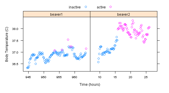

Figure 10.7
> data(USAge.df, package = "latticeExtra") |
lattice
> pl <- xyplot(Population ~ Age | factor(Year), USAge.df,
+     groups = Sex, type = c("l", "g"), auto.key = list(points = FALSE,
+         lines = TRUE, columns = 2), aspect = "xy", ylab = "Population (millions)",
+     subset = Year %in% seq(1905, 1975, by = 10))
> print(pl)
|
ggplot2
> pg <- ggplot(USAge.df, aes(Age, Population, colour = Sex)) +
+     geom_line(subset = .(Year %in% seq(1905, 1975, by = 10))) +
+     facet_wrap(~Year, ncol = 4) + ylab("Population (millions)")
> print(pg)
|
|
Note |
ggplot2 doesn’t have the equivalent of aspect="xy" in lattice, which “tries to compute the aspect based on the 45 degree banking rule”. |


Figure 10.8
lattice
> pl <- xyplot(Population ~ Year | factor(Age), USAge.df, + groups = Sex, type = "l", strip = FALSE, strip.left = TRUE, + layout = c(1, 3), ylab = "Population (millions)", + auto.key = list(lines = TRUE, points = FALSE, columns = 2), + subset = Age %in% c(0, 10, 20)) > print(pl) |
ggplot2
> pg <- ggplot(USAge.df, aes(Year, Population, colour = Sex)) +
+     geom_line(subset = .(Age %in% c(0, 10, 20))) + facet_grid(Age ~
+     .) + ylab("Population (millions)")
> print(pg)
|


Figure 10.9
lattice
> pl <- xyplot(Population ~ Year | factor(Year - Age),
+     USAge.df, groups = Sex, subset = (Year - Age) %in%
+         1894:1905, type = c("g", "l"), ylab = "Population (millions)",
+     auto.key = list(lines = TRUE, points = FALSE, columns = 2))
> print(pl)
|
ggplot2
> USAge.df$YearAge <- with(USAge.df, Year - Age) |
> pg <- ggplot(USAge.df, aes(Year, Population, colour = Sex)) +
+     geom_line(subset = .((YearAge) %in% 1894:1905)) +
+     facet_wrap(~YearAge) + ylab("Population (millions)")
> print(pg)
|


Figure 10.10
lattice
> pl <- xyplot(stations ~ mag, quakes, jitter.x = TRUE,
+     type = c("p", "smooth"), xlab = "Magnitude (Richter)",
+     ylab = "Number of stations reporting")
> print(pl)
|
ggplot2
> pg <- ggplot(quakes, aes(mag, stations)) + geom_jitter(position = position_jitter(width = 0.01),
+     shape = 1) + geom_smooth(method = "loess", se = F) +
+     xlab("Magnitude (Richter)") + ylab("Number of stations reporting")
> print(pg)
|


Figure 10.11
> quakes$Mag <- equal.count(quakes$mag, number = 10, overlap = 0.2) |
lattice
> ps.mag <- plot(quakes$Mag, ylab = "Level", xlab = "Magnitude (Richter)") > bwp.quakes <- bwplot(stations ~ Mag, quakes, xlab = "Magnitude", + ylab = "Number of stations reporting") > plot(bwp.quakes, position = c(0, 0, 1, 0.65)) > plot(ps.mag, position = c(0, 0.65, 1, 1), newpage = FALSE) |
ggplot2
> Layout <- grid.layout(nrow = 2, ncol = 1, heights = unit(c(1,
+     2), c("null", "null")))
> grid.show.layout(Layout)
> vplayout <- function(...) {
+     grid.newpage()
+     pushViewport(viewport(layout = Layout))
+ }
> subplot <- function(x, y) viewport(layout.pos.row = x,
+     layout.pos.col = y)
> pr <- function() {
+     vplayout()
+     print(p1, vp = subplot(1, 1))
+     print(p2, vp = subplot(2, 1))
+ }
|
> fn <- function(data = quakes$mag, number = 4, ...) {
+     intrv <<- as.data.frame(co.intervals(data, number,
+         ...))
+     mag <- sort(unique(data))
+     intervals <- ldply(mag, function(x) {
+         t(as.numeric(x < intrv$V2 & x > intrv$V1))
+     })
+     tmp <- melt(cbind(mag, intervals), id.var = 1)
+     tmp[tmp$value > 0, 1:2]
+ }
> quakes.ordered <- merge(quakes, fn(number = 10, overlap = 0.2))
> intrv <- with(intrv, paste(V1, V2, sep = "-"))
> quakes.ordered <- rename(quakes.ordered, c(variable = "magnitude"))
> quakes.ordered$magnitude <- factor(quakes.ordered$magnitude,
+     labels = intrv)
|
> p1 <- ggplot(fn(number = 10, overlap = 0.2), aes(variable,
+     mag)) + stat_summary(aes(xmin = as.numeric(variable) -
+     0.4, xmax = as.numeric(variable) + 0.4), fun.ymin = min,
+     fun.ymax = max, geom = "rect") + coord_flip()
> p2 <- ggplot(quakes.ordered, aes(as.numeric(magnitude),
+     stations, group = magnitude)) + geom_boxplot() +
+     xlab("Magnitude") + ylab("Number of stations reporting")
> pr()
|


Figure 10.12
lattice
> pl <- bwplot(sqrt(stations) ~ Mag, quakes, scales = list(x = list(limits = as.character(levels(quakes$Mag)),
+     rot = 60)), xlab = "Magnitude (Richter)", ylab = expression(sqrt("Number of stations")))
> print(pl)
|
ggplot2
> pg <- ggplot(quakes.ordered, aes(magnitude, sqrt(stations),
+     group = magnitude)) + geom_boxplot() + xlab("Magnitude (Richter)") +
+     ylab(expression(sqrt("Number of stations"))) + opts(axis.text.x = theme_text(angle = 45,
+     hjust = 1, colour = "grey50"))
> print(pg)
|
|
Note |
ggplot2 doesn’t have the equivalent of aspect="xy" in lattice, which “tries to compute the aspect based on the 45 degree banking rule”. |


Figure 10.13
lattice
> pl <- qqmath(~sqrt(stations) | Mag, quakes, type = c("p",
+     "g"), pch = ".", cex = 3, prepanel = prepanel.qqmathline,
+     aspect = "xy", strip = strip.custom(strip.levels = TRUE,
+         strip.names = FALSE), xlab = "Standard normal quantiles",
+     ylab = expression(sqrt("Number of stations")))
> print(pl)
|
ggplot2
> pg <- ggplot(quakes.ordered, aes(sample = sqrt(stations))) +
+     geom_point(stat = "qq") + facet_wrap(~magnitude,
+     nrow = 2) + scale_x_continuous("Standard normal quantiles") +
+     scale_y_continuous(expression(sqrt("Number of stations")))
> print(pg)
|
|
Note |
ggplot2 doesn’t have the equivalent of aspect="xy" in lattice, which “tries to compute the aspect based on the 45 degree banking rule”. |


Figure 10.14
lattice
> pl <- xyplot(sqrt(stations) ~ mag, quakes, cex = 0.6,
+     panel = panel.bwplot, horizontal = FALSE, box.ratio = 0.05,
+     xlab = "Magnitude (Richter)", ylab = expression(sqrt("Number of stations")))
> print(pl)
|
ggplot2
> pg <- ggplot(quakes.ordered, aes(factor(mag), sqrt(stations))) +
+     geom_boxplot() + xlab("Magnitude (Richter)") + ylab(expression(sqrt("Number of stations")))
> print(pg)
|


Figure 10.15
> state.density <- data.frame(name = state.name, area = state.x77[, + "Area"], population = state.x77[, "Population"], + region = state.region) > state.density$density <- with(state.density, population/area) |
lattice
> pl <- dotplot(reorder(name, density) ~ density, state.density, + xlab = "Population Density (thousands per square mile)") > print(pl) |
ggplot2
> pg <- ggplot(state.density, aes(density, reorder(name,
+     density))) + geom_point() + xlab("Population Density (thousands per square mile)")
> print(pg)
|


Figure 10.16
lattice
> state.density$Density <- shingle(state.density$density, + intervals = rbind(c(0, 0.2), c(0.2, 1))) |
> pl <- dotplot(reorder(name, density) ~ density | Density, + state.density, strip = FALSE, layout = c(2, 1), levels.fos = 1:50, + scales = list(x = "free"), between = list(x = 0.5), + xlab = "Population Density (thousands per square mile)", + par.settings = list(layout.widths = list(panel = c(2, + 1)))) > print(pl) |
ggplot2
> state.density$pos <- state.density$density > 0.2 |
> pg <- ggplot(state.density, aes(density, reorder(name,
+     density))) + geom_point() + facet_grid(~pos, scales = "free_x") +
+     xlab("Population Density (thousands per square mile)") +
+     opts(strip.background = theme_blank(), strip.text.x = theme_blank())
> print(pg)
|
|
Note |
It is not possible to change the facet width in ggplot2. |


Figure 10.17
lattice
> cutAndStack <- function(x, number = 6, overlap = 0.1,
+     type = "l", xlab = "Time", ylab = deparse(substitute(x)),
+     ...) {
+     time <- if (is.ts(x))
+         time(x)
+     else seq_along(x)
+     Time <- equal.count(as.numeric(time), number = number,
+         overlap = overlap)
+     xyplot(as.numeric(x) ~ time | Time, type = type,
+         xlab = xlab, ylab = ylab, default.scales = list(x = list(relation = "free"),
+             y = list(relation = "free")), ...)
+ }
|
> pl <- cutAndStack(EuStockMarkets[, "DAX"], aspect = "xy", + scales = list(x = list(draw = FALSE), y = list(rot = 0))) > print(pl) |
ggplot2
> library(zoo) |
> cutAndStack_g <- function(data, number = 4, overlap = 0.1) {
+     ylab = deparse(substitute(data))
+     data <- as.data.frame(data)
+     data$id <- if (is.ts(data$x))
+         time(data$x)
+     else seq_along(data$x)
+     intrv <<- as.data.frame(co.intervals(data$id, number,
+         overlap))
+     x <- sort(unique(data$id))
+     intervals <- ldply(x, function(x) {
+         t(as.numeric(x < intrv$V2 & x > intrv$V1))
+     })
+     tmp <- melt(cbind(x, intervals), id.var = 1)
+     tmp <- tmp[tmp$value > 0, 1:2]
+     tmp <- rename(tmp, c(x = "id"))
+     stock <- merge(data, tmp)
+     stock$variable <- factor(stock$variable, labels = with(intrv,
+         paste(as.yearmon(V1), as.yearmon(V2), sep = " - ")))
+     p <- ggplot(stock, aes(id, x)) + geom_line() + facet_wrap(~variable,
+         scales = "free", ncol = 1, as.table = FALSE) +
+         scale_x_continuous("", breaks = NA) + ylab(ylab)
+     print(p)
+ }
|
> cutAndStack_g(data = EuStockMarkets[, "DAX"], number = 6, + overlap = 0.1) |
|
Note |
ggplot2 doesn’t have the equivalent of aspect=”xy” in lattice, which “tries to compute the aspect based on the 45 degree banking rule”. |


Figure 10.18
lattice
> bdp1 <- dotplot(as.character(variety) ~ yield | as.character(site), + barley, groups = year, layout = c(1, 6), auto.key = list(space = "top", + columns = 2), aspect = "fill") > bdp2 <- dotplot(variety ~ yield | site, barley, groups = year, + layout = c(1, 6), auto.key = list(space = "top", + columns = 2), aspect = "fill") > plot(bdp1, split = c(1, 1, 2, 1)) > plot(bdp2, split = c(2, 1, 2, 1), newpage = FALSE) |
ggplot2
> Layout <- grid.layout(ncol = 3, widths = unit(c(2, 2,
+     0.75), c("null", "null", "null")))
> vplayout <- function(...) {
+     grid.newpage()
+     pushViewport(viewport(layout = Layout))
+ }
> subplot <- function(x, y) viewport(layout.pos.row = x,
+     layout.pos.col = y)
> pr <- function() {
+     vplayout()
+     print(p_left, vp = subplot(1, 1))
+     print(p_right, vp = subplot(1, 2))
+     print(legend, vp = subplot(1, 3))
+ }
|
> p <- ggplot(barley, aes(yield, variety, colour = year)) +
+     geom_point() + facet_wrap(~site, ncol = 1) + ylab("")
> legend <- p + opts(keep = "legend_box")
> p_right <- p + opts(legend.position = "none")
> barley$site <- factor(barley$site, levels = sort(levels(barley$site)))
> barley$variety <- factor(barley$variety, levels = sort(levels(barley$variety)))
> p_left <- p_right %+% barley
> pr()
|


Figure 10.19
> state.density <- data.frame(name = state.name, area = state.x77[, + "Area"], population = state.x77[, "Population"], + region = state.region) > state.density$density <- with(state.density, population/area) |
lattice
> pl <- dotplot(reorder(name, density) ~ 1000 * density, + state.density, scales = list(x = list(log = 10)), + xlab = "Density (per square mile)") > print(pl) |
ggplot2
> pg <- ggplot(state.density, aes(density * 1000, reorder(name,
+     density))) + geom_point() + scale_x_log10() + xlab("Density (per square mile)") +
+     ylab("")
> print(pg)
|


Figure 10.20
> state.density$region <- with(state.density, reorder(region, + density, median)) > state.density$name <- with(state.density, reorder(reorder(name, + density), as.numeric(region))) |
lattice
> pl <- dotplot(name ~ 1000 * density | region, state.density, + strip = FALSE, strip.left = TRUE, layout = c(1, 4), + scales = list(x = list(log = 10), y = list(relation = "free")), + xlab = "Density (per square mile)") > print(pl) |
ggplot2
> pg <- ggplot(state.density, aes(1000 * density, name)) +
+     geom_point() + facet_grid(region ~ ., scales = "free_y") +
+     scale_x_log10() + xlab("Density (per square mile)") +
+     ylab("")
> print(pg)
|


Figure 10.21
> library("latticeExtra")
|
lattice
> print(pl) > print(resizePanels()) |
ggplot2
> pg <- pg + facet_grid(region~., scales = "free_y", space = "free", as.table = FALSE) > print(pg) |


Figure 10.22
> data(USCancerRates, package = "latticeExtra") |
lattice
> pl <- xyplot(rate.male ~ rate.female | state, USCancerRates,
+     aspect = "iso", pch = ".", cex = 2, index.cond = function(x,
+         y) {
+         median(y - x, na.rm = TRUE)
+     }, scales = list(log = 2, at = c(75, 150, 300, 600)),
+     panel = function(...) {
+         panel.grid(h = -1, v = -1)
+         panel.abline(0, 1)
+         panel.xyplot(...)
+     })
> print(pl)
|
ggplot2
> med <- ddply(USCancerRates, .(state), summarise, med = median(rate.female - + rate.male, na.rm = TRUE)) > med$state <- with(med, reorder(state, med)) > USCancerRates$state <- factor(USCancerRates$state, levels = levels(med$state)) |
> pg <- ggplot(USCancerRates, aes(rate.female, rate.male)) + + geom_point(size = 1) + geom_abline(intercept = 0, + slope = 1) + scale_x_log2(breaks = c(75, 150, 300, + 600), labels = c(75, 150, 300, 600)) + scale_y_log2(breaks = c(75, + 150, 300, 600), labels = c(75, 150, 300, 600)) + + facet_wrap(~state, ncol = 7) > print(pg) |
|
Note |
For some strange reason the order of facets is different compared to lattice plot, although the formula to set the levels is the same! |


Figure 10.23
> data(Chem97, package = "mlmRev") |
lattice
> strip.style4 <- function(..., style) {
+     strip.default(..., style = 4)
+ }
|
> pl <- qqmath(~gcsescore | factor(score), Chem97, groups = gender,
+     type = c("l", "g"), aspect = "xy", auto.key = list(points = FALSE,
+         lines = TRUE, columns = 2), f.value = ppoints(100),
+     strip = strip.style4, xlab = "Standard normal quantiles",
+     ylab = "Average GCSE score")
> print(pl)
|
ggplot2
> pg <- ggplot(Chem97, aes(sample = gcsescore, colour = gender)) +
+     geom_point(stat = "qq", quantiles = ppoints(100)) +
+     facet_wrap(~score) + scale_x_continuous("Standard Normal Quantiles") +
+     scale_y_continuous("Average GCSE Score") + theme_bw()
> print(pg)
|
|
Note |
ggplot2 doesn’t have the equivalent of aspect="xy" in lattice, which “tries to compute the aspect based on the 45 degree banking rule”. |


Figure 10.24
lattice
> strip.combined <- function(which.given, which.panel,
+     factor.levels, ...) {
+     if (which.given == 1) {
+         panel.rect(0, 0, 1, 1, col = "grey90", border = 1)
+         panel.text(x = 0, y = 0.5, pos = 4, lab = factor.levels[which.panel[which.given]])
+     }
+     if (which.given == 2) {
+         panel.text(x = 1, y = 0.5, pos = 2, lab = factor.levels[which.panel[which.given]])
+     }
+ }
|
> pl <- qqmath(~gcsescore | factor(score) + gender, Chem97,
+     f.value = ppoints(100), type = c("l", "g"), aspect = "xy",
+     strip = strip.combined, par.strip.text = list(lines = 0.5),
+     xlab = "Standard normal quantiles", ylab = "Average GCSE score")
> print(pl)
|
ggplot2
> Chem97 <- transform(Chem97, sc_gen = paste(score, gender)) |
> library(gtools) > Chem97$sc_gen <- factor(Chem97$sc_gen, levels = mixedsort(unique(Chem97$sc_gen))) |
> pg <- ggplot(Chem97, aes(sample = gcsescore)) + geom_point(stat = "qq",
+     quantiles = ppoints(100)) + facet_wrap(~sc_gen, nrow = 2) +
+     scale_x_continuous("Standard normal quantiles") +
+     scale_y_continuous("Average GCSE score")
> print(pg)
|
|
Note |
ggplot2 doesn’t have the equivalent of aspect="xy" in lattice, which “tries to compute the aspect based on the 45 degree banking rule”. |


Figure 10.25
> morris <- barley$site == "Morris" > barley$year[morris] <- ifelse(barley$year[morris] == + "1931", "1932", "1931") |
lattice
> pl <- stripplot(sqrt(abs(residuals(lm(yield ~ variety +
+     year + site)))) ~ site, data = barley, groups = year,
+     jitter.data = TRUE, auto.key = list(points = TRUE,
+         lines = TRUE, columns = 2), type = c("p", "a"),
+     fun = median, ylab = expression(abs("Residual Barley Yield")^{
+         1/2
+     }))
> print(pl)
|
ggplot2
> pg <- ggplot(barley, aes(site, sqrt(abs(residuals(lm(yield ~
+     variety + year + site)))), colour = year)) + geom_jitter(position = position_jitter(w = 0.1)) +
+     geom_line(stat = "summary", fun.y = median, aes(group = year)) +
+     ylab(expression(abs("Residual Barley Yield")^{
+         1/2
+     }))
> print(pg)
|


For figure 10.25 may I suggest changing the default position_jitter
pg <- ggplot(barley, aes(site, sqrt(abs(residuals(lm(yield ~
variety + year + site)))), colour = year)) +
geom_jitter(position = position_jitter(h=0,w=.1)) +
geom_line(stat = "summary", fun.y = median, aes(group = year)) +
ylab(expression(abs("Residual Barley Yield")^{
1/2
}))
print(pg)
Thanks.
I have updated the post with your suggestion.
Hi,
In Fig. 10.16 (and others such Fig. 10.19), the label on the x-axis is not centered with respect to the plot’s axis for those drawn using ggplot2, however the ones drawn using lattice are centered.
Any idea on how this can be fixed?
Cheers,
Rahul
You’re right – I hadn’t noticed this before.
It seems that the only way is to manually adjust the positioning of the x-axis title using opts(). Currently the title is centered in relation to the plot area not the x-axis.