ggplot2 Version of Figures in “Lattice: Multivariate Data Visualization with R” (Part 3)
July 2, 2009
This is the third post in a series attempting to recreate the figures in Lattice: Multivariate Data Visualization with R (R code) with ggplot2.
Chapter 3 – Visualizing Univariate Distributions
Topics covered:
- Kernel Density Plot, Histogram
- Theoretical Q-Q plot, Empirical CDF plot
- Two-sample Q-Q plot
- Comparative Box and Whisker plots, Violin plots
- Comparative Strip charts
- Discrete distributions
Figure 3.1
> library(lattice) > library(ggplot2) > data(Oats, package = "MEMSS") |
lattice
> pl <- densityplot(~eruptions, data = faithful) > print(pl) |
ggplot2
> p <- ggplot(faithful, aes(eruptions)) > pg <- p + stat_density(geom = "path", position = "identity") + + geom_point(aes(y = 0.05), position = position_jitter(height = 0.005), + alpha = 0.25) > print(pg) |
|
Note |
y = 0.05 specifies the position of jitter on y-axis. |


Figure 3.2
lattice
> pl <- densityplot(~eruptions, data = faithful, kernel = "rect", + bw = 0.2, plot.points = "rug", n = 200) > print(pl) |
ggplot2
> pg <- p + stat_density(geom = "path", kernel = "rect", + position = "identity", bw = 0.2) + geom_rug() > print(pg) |


Figure 3.3
> library("latticeExtra")
> data(gvhd10)
|
lattice
> pl <- densityplot(~log(FSC.H) | Days, data = gvhd10, + plot.points = FALSE, ref = TRUE, layout = c(2, 4)) > print(pl) |
ggplot2
> p <- ggplot(gvhd10, aes(log(FSC.H))) > pg <- p + stat_density(geom = "path", position = "identity") + + facet_wrap(~Days, ncol = 2, as.table = FALSE) > print(pg) |
|
Note |
as.table = FALSE changes the default orders of the facets. |


Figure 3.4
lattice
> pl <- histogram(~log2(FSC.H) | Days, gvhd10, xlab = "log Forward Scatter", + type = "density", nint = 50, layout = c(2, 4)) > print(pl) |
ggplot2
> pg <- p + geom_histogram(aes(y = ..density..), binwidth = diff(range(log2(gvhd10$FSC.H)))/50) +
+     facet_wrap(~Days, ncol = 2, as.table = FALSE) + xlab("log Forward Scatter")
> print(pg)
|
|
Note |
ggplot2 uses binwidth by default, therefore the number of bins needs to be presented in terms of binwidth. |


Figure 3.5
> data(Chem97, package = "mlmRev") |
lattice
> pl <- qqmath(~gcsescore | factor(score), data = Chem97, + f.value = ppoints(100)) > print(pl) |
ggplot2
> p <- ggplot(Chem97) > pg <- p + geom_point(aes(sample = gcsescore), stat = "qq", + quantiles = ppoints(100)) + facet_wrap(~score) > print(pg) |


Figure 3.6
lattice
> pl <- qqmath(~gcsescore | gender, Chem97, groups = score, + aspect = "xy", f.value = ppoints(100), auto.key = list(space = "right"), + xlab = "Standard Normal Quantiles", ylab = "Average GCSE Score") > print(pl) |
ggplot2
> pg <- p + geom_point(aes(sample = gcsescore, colour = factor(score)),
+     stat = "qq", quantiles = ppoints(100)) + facet_grid(~gender) +
+     opts(aspect.ratio = 1) + scale_x_continuous("Standard Normal Quantiles") +
+     scale_y_continuous("Average GCSE Score")
> print(pg)
|


Figure 3.7
lattice
> Chem97.mod <- transform(Chem97, gcsescore.trans = gcsescore^2.34) |
> pl <- qqmath(~gcsescore.trans | gender, Chem97.mod, groups = score, + f.value = ppoints(100), aspect = "xy", auto.key = list(space = "right", + title = "score"), xlab = "Standard Normal Quantiles", + ylab = "Transformed GCSE Score") > print(pl) |
ggplot2
> pg <- p + geom_point(aes(sample = gcsescore^2.34, colour = factor(score)),
+     stat = "qq", quantiles = ppoints(100)) + facet_grid(~gender) +
+     opts(aspect.ratio = 1) + scale_x_continuous("Standard Normal Quantiles") +
+     scale_y_continuous("Transformed GCSE Score")
> print(pg)
|


Figure 3.8
> library("latticeExtra")
|
lattice
> pl <- ecdfplot(~gcsescore | factor(score), data = Chem97, + groups = gender, auto.key = list(columns = 2), subset = gcsescore > + 0, xlab = "Average GCSE Score") > print(pl) |
ggplot2
> Chem97.ecdf <- ddply(Chem97, .(score, gender), transform, + ecdf = ecdf(gcsescore)(gcsescore)) |
> p <- ggplot(Chem97.ecdf, aes(gcsescore, ecdf, colour = gender))
> pg <- p + geom_step(subset = .(gcsescore > 0)) + facet_wrap(~score,
+     as.table = F) + xlab("Average GCSE Score") + ylab("Empirical CDF")
> print(pg)
|


Figure 3.9
lattice
> pl <- qqmath(~gcsescore | factor(score), data = Chem97, + groups = gender, auto.key = list(points = FALSE, + lines = TRUE, columns = 2), subset = gcsescore > + 0, type = "l", distribution = qunif, prepanel = prepanel.qqmathline, + aspect = "xy", xlab = "Standard Normal Quantiles", + ylab = "Average GCSE Score") > print(pl) |
ggplot2
> p <- ggplot(Chem97, aes(sample = gcsescore, colour = gender))
> pg <- p + geom_path(subset = .(gcsescore > 0), stat = "qq",
+     distribution = qunif) + facet_grid(~score) + scale_x_continuous("Standard Normal Quantiles") +
+     scale_y_continuous("Average GCSE Score")
> print(pg)
|


Figure 3.10
lattice
> pl <- qq(gender ~ gcsescore | factor(score), Chem97, + f.value = ppoints(100), aspect = 1) > print(pl) |
ggplot2
> q <- function(x, probs = ppoints(100)) {
+     data.frame(q = probs, value = quantile(x, probs))
+ }
> Chem97.q <- ddply(Chem97, c("gender", "score"), function(df) q(df$gcsescore))
> Chem97.df <- recast(Chem97.q, score + q ~ gender, id.var = 1:3)
|
> pg <- ggplot(Chem97.df) + geom_point(aes(M, F)) + geom_abline() + + facet_wrap(~score) + coord_equal() > print(pg) |


Figure 3.11
lattice
> pl <- bwplot(factor(score) ~ gcsescore | gender, data = Chem97, + xlab = "Average GCSE Score") > print(pl) |
ggplot2
> pg <- ggplot(Chem97, aes(factor(score), gcsescore)) +
+     geom_boxplot() + coord_flip() + ylab("Average GCSE score") +
+     facet_wrap(~gender)
> print(pg)
|

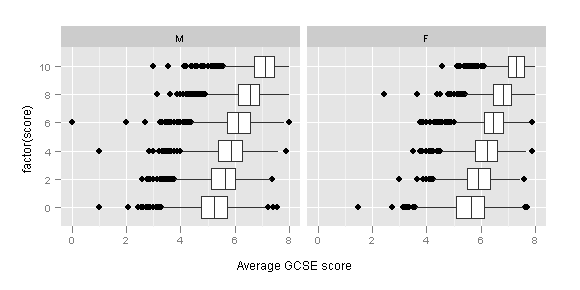
Figure 3.12
lattice
> pl <- bwplot(gcsescore^2.34 ~ gender | factor(score), + Chem97, varwidth = TRUE, layout = c(6, 1), ylab = "Transformed GCSE score") > print(pl) |
ggplot2
> p <- ggplot(Chem97, aes(factor(gender), gcsescore^2.34))
> pg <- p + geom_boxplot() + facet_grid(~score) + ylab("Transformed GCSE score")
> print(pg)
|


Figure 3.13
lattice
> pl <- bwplot(Days ~ log(FSC.H), data = gvhd10, xlab = "log(Forward Scatter)", + ylab = "Days Past Transplant") > print(pl) |
ggplot2
> p <- ggplot(gvhd10, aes(factor(Days), log(FSC.H))) > pg <- p + geom_boxplot() + coord_flip() + labs(y = "log(Forward Scatter)", + x = "Days Past Transplant") > print(pg) |


Figure 3.14
lattice
> pl <- bwplot(Days ~ log(FSC.H), gvhd10, panel = panel.violin, + box.ratio = 3, xlab = "log(Forward Scatter)", ylab = "Days Past Transplant") > print(pl) |
ggplot2
> p <- ggplot(gvhd10, aes(log(FSC.H), Days)) > pg <- p + geom_ribbon(aes(ymax = ..density.., ymin = -..density..), + stat = "density") + facet_grid(Days ~ ., as.table = F, + scales = "free_y") + labs(x = "log(Forward Scatter)", + y = "Days Past Transplant") > print(pg) |


Figure 3.15
lattice
> pl <- stripplot(factor(mag) ~ depth, quakes) > print(pl) |
ggplot2
> pg <- ggplot(quakes) + geom_point(aes(depth, mag), shape = 1) > print(pg) |


Figure 3.16
lattice
> pl <- stripplot(depth ~ factor(mag), quakes, jitter.data = TRUE, + alpha = 0.6, xlab = "Magnitude (Richter)", ylab = "Depth (km)") > print(pl) |
ggplot2
> p <- ggplot(quakes, aes(factor(mag), depth))
> pg <- p + geom_point(position = position_jitter(width = 0.15),
+     alpha = 0.6, shape = 1) + theme_bw() + xlab("Magnitude (Richter)") +
+     ylab("Depth (km)")
> print(pg)
|
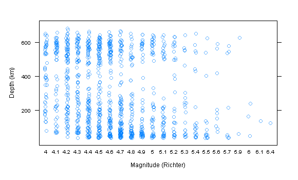

Figure 3.17
lattice
> pl <- stripplot(sqrt(abs(residuals(lm(yield ~ variety +
+     year + site)))) ~ site, data = barley, groups = year,
+     jitter.data = TRUE, auto.key = list(points = TRUE,
+         lines = TRUE, columns = 2), type = c("p", "a"),
+     fun = median, ylab = expression(abs("Residual Barley Yield")^{
+         1/2
+     }))
> print(pl)
|
ggplot2
> p <- ggplot(barley, aes(site, sqrt(abs(residuals(lm(yield ~
+     variety + year + site)))), colour = year, group = year))
> pg <- p + geom_jitter(position = position_jitter(width = 0.2)) +
+     geom_line(stat = "summary", fun.y = "mean") + labs(x = "",
+     y = expression(abs("Residual Barley Yield")^{
+         1/2
+     }))
> print(pg)
|


17 Comments
leave one →
Trackbacks
- ggplot2 Version of Figures in “Lattice: Multivariate Data Visualization with R” (Part 5) « Learning R
- ggplot2 Version of Figures in “Lattice: Multivariate Data Visualization with R” (Part 6) « Learning R
- ggplot2 Version of Figures in “Lattice: Multivariate Data Visualization with R” (Part 10) « Learning R
- ggplot2 Version of Figures in “Lattice: Multivariate Data Visualization with R” (Part 13) « Learning R
- Detecting signatures of altered miRNA activity in expression data


Great again 🙂 You can simplify the code to produce the ecdf dataset a little:
Chem97.ecdf <- ddply(Chem97, .(score, gender), transform,
ecdf = ecdf(gcsescore)(gcsescore)
)
Thanks. I have updated the post.
I’m really enjoying your tutorial series. You’ve sunk a lot of time into these!
Drop me an email when you get a chance. A group of R folks have been organizing some community online activities and I would like your input on a few things.
-JD
truly tiny, but: any way to get rid of the extra labels on the RHS in figure 3.14?
very nice (and impressive to define the violin plot on the fly like that!)
I would rather get rid of the the labels on the left.
However, to get rid of the labels on the right the following code should do the trick (hides them almost completely):
pg + opts(strip.background = theme_rect(fill = NA, colour = NA), strip.text.y = theme_text(size = 0))
Hi,
this is just what I needed to find. Thanks a lot for the very fine examples!
Hi – very nice job! One question: shouldn’t the second piece of ggplot2 code for Figure 3.12 be
pg <- p + geom_boxplot() + facet_grid(~score) + ylab("Transformed GCSE score")
?
Thank you for spotting the typo. It is fixed now.
Your blog is very nice! Good luck to you.
WOW. This is a _great_ comparison.
But just like excelcharts.com’s fools in his office that like a multi-coloured bubble chart better than an unfilled grey one … I can’t tell which I like better!
I’m not even sure whether the ggplot axes are Tufte-compliant. I mean, you’re erasing, but you’re also using more ink. Does “erasing the paper” count as reducing ink? Or adding colour?
So I guess the main issue is, I can’t tell if the grid lines are distracting or add clarity.
Hi,
First of all thank you for the tutorial. But when I am trying the above examples, I’ve got the following annoying error:
gender))
> p p
Ошибка: No layers in plot
Could you please help what is wrong? R version (2.12.0) for Windows
Just upgraded R to 2.12.1 – everything is working now. Thanks a again!!!