ggplot2 Version of Figures in “Lattice: Multivariate Data Visualization with R” (Part 13)
August 20, 2009
This is the 13th post in a series attempting to recreate the figures in Lattice: Multivariate Data Visualization with R (R code available here) with ggplot2.
Previous parts in this series: Part 1, Part 2, Part 3, Part 4, Part 5, Part 6, Part 7, Part 8, Part 9, Part 10, Part 11, Part 12.
Chapter 14 – New Trellis Displays
Topics covered:
- Examples of S3 and S4 methods
- Examples of new high level functions
Figure 14.1
> library(lattice) > library(ggplot2) > library(latticeExtra) |
lattice
> pl <- xyplot(sunspot.year, aspect = "xy", strip = FALSE, + strip.left = TRUE, cut = list(number = 4, overlap = 0.05)) > print(pl) |
ggplot2
> sunspot.g <- function(data, number = 4, overlap = 0.05) {
+     data <- as.data.frame(data)
+     data$id <- if (is.ts(data$x))
+         time(data$x)
+     else seq_along(data$x)
+     intrv <- as.data.frame(co.intervals(data$id, number,
+         overlap))
+     x <- sort(unique(data$id))
+     intervals <- ldply(x, function(x) {
+         t(as.numeric(x < intrv$V2 & x > intrv$V1))
+     })
+     tmp <- melt(cbind(x, intervals), id.var = 1)
+     tmp <- tmp[tmp$value > 0, 1:2]
+     tmp <- rename(tmp, c(x = "id"))
+     merge(data, tmp)
+ }
|
> pg <- ggplot(sunspot.g(sunspot.year), aes(id, x)) + geom_line() +
+     facet_wrap(~variable, scales = "free_x", ncol = 1,
+         as.table = FALSE) + opts(strip.background = theme_blank(),
+     strip.text.x = theme_blank()) + opts(panel.margin = unit(-0.25,
+     "lines")) + xlab("Time")
> print(pg)
|


Figure 14.2
> data(biocAccess, package = "latticeExtra") |
lattice
> ssd <- stl(ts(biocAccess$counts[1:(24 * 30 * 2)], frequency = 24), + "periodic") |
> pl <- xyplot(ssd, xlab = "Time (Days)") > print(pl) |
ggplot2
> time <- data.frame(data = ts(biocAccess$counts[1:(24 * + 30 * 2)], frequency = 24)) > time$id <- as.numeric(time(time$data)) > time$data <- as.numeric(time$data) > time.series <- as.data.frame(ssd$time.series) > time.series <- cbind(time, time.series) > time.series <- melt(time.series, id.vars = "id") |
> pg <- ggplot(time.series, aes(id, value)) + geom_line() +
+     facet_grid(variable ~ ., scales = "free_y") + xlab("Time (Days)")
> print(pg)
|


Figure 14.3
> library("flowViz")
> data(GvHD, package = "flowCore")
|
lattice
> pl <- densityplot(Visit ~ `FSC-H` | Patient, data = GvHD) > print(pl) |
ggplot2
It should be possible to produce a similar graph in ggplot2, however I was not able to figure out how to extract the relevant data from an object of class "flowSet". |

Figure 14.4
> library("hexbin")
> data(NHANES)
|
lattice
> pl <- hexbinplot(Hemoglobin ~ TIBC | Sex, data = NHANES, + aspect = 0.8) > print(pl) |
ggplot2
> pg <- ggplot(NHANES, aes(TIBC, Hemoglobin)) + geom_hex() + + facet_grid(~Sex) + opts(aspect.ratio = 0.8) > print(pg) |


Figure 14.5
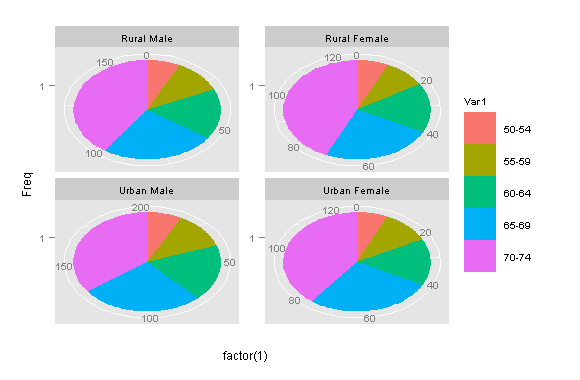
> data(Chem97, package = "mlmRev") |
lattice
> panel.piechart <- function(x, y, labels = as.character(y),
+     edges = 200, radius = 0.8, clockwise = FALSE, init.angle = if (clockwise) 90 else 0,
+     density = NULL, angle = 45, col = superpose.polygon$col,
+     border = superpose.polygon$border, lty = superpose.polygon$lty,
+     ...) {
+     stopifnot(require("gridBase"))
+     superpose.polygon <- trellis.par.get("superpose.polygon")
+     opar <- par(no.readonly = TRUE)
+     on.exit(par(opar))
+     if (panel.number() > 1)
+         par(new = TRUE)
+     par(fig = gridFIG(), omi = c(0, 0, 0, 0), mai = c(0,
+         0, 0, 0))
+     pie(as.numeric(x), labels = labels, edges = edges,
+         radius = radius, clockwise = clockwise, init.angle = init.angle,
+         angle = angle, density = density, col = col,
+         border = border, lty = lty)
+ }
> piechart <- function(x, data = NULL, panel = "panel.piechart",
+     ...) {
+     ocall <- sys.call(sys.parent())
+     ocall[[1]] <- quote(piechart)
+     ccall <- match.call()
+     ccall$data <- data
+     ccall$panel <- panel
+     ccall$default.scales <- list(draw = FALSE)
+     ccall[[1]] <- quote(lattice::barchart)
+     ans <- eval.parent(ccall)
+     ans$call <- ocall
+     ans
+ }
> pl <- piechart(VADeaths, groups = FALSE, xlab = "")
> print(pl)
|
ggplot2
> pg <- ggplot(as.data.frame.table(VADeaths), aes(x = factor(1), + y = Freq, fill = Var1)) + geom_bar(width = 1) + facet_wrap(~Var2, + scales = "free_y") + coord_polar(theta = "y") > print(pg) |

3 Comments
leave one →


Hello
Could you put all the 13 parts in one page or in a pdf, please?
I’d like to print it.
thanks
This has been done already.
Have a look at this.
You can extract and reshape a flowSet into “long” formatted for ggplot2 using the function below:
flowset2ggplot<-function(flowset=NULL){
require(reshape)
require(flowCore)
names<-sampleNames(flowset)
columns<-colnames(flowset)
flowMatrix<-matrix(nrow=0, ncol=length(columns)+1)
for (i in length(flowset)) {
flowMatrix<-rbind(flowMatrix,cbind(name=rep(names[[i]],dim(flowset[[i]])[1]),exprs(flowset[[i]][,columns])))
}
flowFrame<-as.data.frame(flowMatrix)
return(melt(flowFrame,id="name",measure=columns))
}