ggplot2: Crayola Crayon Colours
Statistical Algorithms blog attempted to recreate a graph depicting the growing colour selection of Crayola crayons in ggplot2 (original graph below via FlowingData).
He also asked the following questions: Is there an easier way to do this? How can I make the axes more like the original? What about the white lines between boxes and the gradual change between years? The sort order is also different.
I will present my version in this post, trying to address some of these questions.

Data Import
The list of Crayola crayon colours is available on Wikipedia, and also contains one duplicate colour (#FF1DCE) that was excluded to make further processing easier.
> library(XML) > library(ggplot2) |
> theurl <- "http://en.wikipedia.org/wiki/List_of_Crayola_crayon_colors"
> html <- htmlParse(theurl)
> crayola <- readHTMLTable(html, stringsAsFactors = FALSE)[[2]]
> crayola <- crayola[, c("Hex Code", "Issued", "Retired")]
> names(crayola) <- c("colour", "issued", "retired")
> crayola <- crayola[!duplicated(crayola$colour),
+     ]
> crayola$retired[crayola$retired == ""] <- 2010
|
Plotting
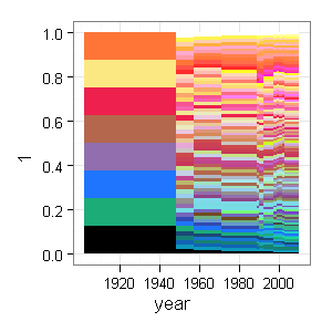
Instead of geom_rect() I will show two options of plotting the same data using geom_bar() and geom_area() to plot the data, and need to ensure that there’s one entry per colour per year it was(is) in the production.
> colours <- ddply(crayola, .(colour), transform, + year = issued:retired) |
The plot colours are manually mapped to the original colours using scale_fill_identity().
> p <- ggplot(colours, aes(year, 1, fill = colour)) + + geom_bar(width = 1, position = "fill", binwidth = 1) + + theme_bw() + scale_fill_identity() |
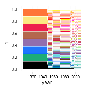
And now the geom_area() version:
> p1 <- ggplot(colours, aes(year, 1, fill = colour)) + + geom_area(position = "fill", colour = "white") + + theme_bw() + scale_fill_identity() |
Final Formatting
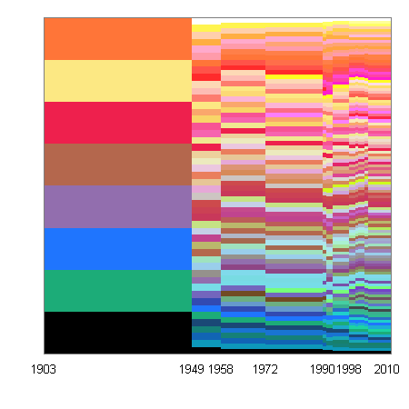
Next, the x-axis labels suggested by ggplot2 will be manualy overridden. Also I use a little trick to make sure that the labels are properly aligned.
> labels <- c(1903, 1949, 1958, 1972, 1990, 1998,
+     2010)
> breaks <- labels - 1
> x <- scale_x_continuous("", breaks = breaks, labels = labels,
+     expand = c(0, 0))
> y <- scale_y_continuous("", expand = c(0, 0))
> ops <- opts(axis.text.y = theme_blank(), axis.ticks = theme_blank())
|
> p + x + y + ops |
> p1 + x + y + ops |
The order of colours could be changed by sorting the colours by some common feature, unfortunately I did not find an automated way of doing this.
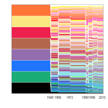
Sorting by Colour
Thanks to Baptiste who showed a way to sort the colours, the final version of the area plot resembles the original even more closely.
> library(colorspace) |
> sort.colours <- function(col) {
+     c.rgb = col2rgb(col)
+     c.RGB = RGB(t(c.rgb) %*% diag(rep(1/255, 3)))
+     c.HSV = as(c.RGB, "HSV")@coords
+     order(c.HSV[, 1], c.HSV[, 2], c.HSV[, 3])
+ }
> colours = ddply(colours, .(year), function(d) d[rev(sort.colours(d$colour)),
+     ])
|
> last_plot() %+% colours |

Trackbacks
- Mosaic time series in R » Statistical Algorithms
- Tweets that mention ggplot2: Crayola Crayon Colours « Learning R -- Topsy.com
- blag » Crayola colours
- Japanese Fisheries Scientists on Japanese Media Coverage of the CITES Bluefin Tuna Decision « achikule!
- Fargestifter - Lilly Apps
- Further points on crayon colors | The stupidest thing...
- Somewhere else, part 1666 | Freakonometrics


That looks great! I think the key thing missing (beyond the color sort) is the white lines above each color. Any ideas there?
White lines above each colour are possible only for the area plot.
I have updated the post accordingly.
Fantastic. That looks much closer to the original.
Nice chart and great blog!
I’m curious if you have any ideas on smoothing the edges out in this chart?
Unfortunately, I don’t think it is possible to smooth the edges.
I would like to be proven wrong, though.
It is smooth using Cairo. Cairo is much slower, of course.
I think it has to do with whether anti-aliasing is turned on with your build of R. I couldn’t figure out what one of my friends was on about when he said all his graphics in R were jagged looking. It turns out that anti-aliasing is on by default on Mac OS X, but not some other platforms.
As the other poster mentioned, Cairo seems to fix this (at least on Linux?). I found this website that talks about how to use Cairo: http://www.mailund.dk/index.php/2009/01/25/antialias-plotting-in-r-using-cairo/
I started working through examples yesterday (only finished the Playmate BMI graph so far), but I can confirm that the PDFs dumped out of my Mac with a stock download of R do look crisp and antialiased.
p1 vs. p certainly cleans up much of the issue of the “rough” edges.
Color sort should be easy in HSV, but it looks from a quick googling like there might be some trickiness in converting between color spaces in R. I suspect that an actual color sort will make some of the branches seem less gnarled than the original.
The original colors look better than their uncorrected hex representations because of color profiles (this would be an easy improvement).
Wikipedia also has RGB, if that would help. I just pulled in HEX in the original version because I didn’t realize that sorting on HEX would result in this crazy configuration. That being said, I think that it’s clear that sorting colors is no easy matter.
I believe the colorspace package could help in sorting the colours. A quick test follows,
library(colorspace)
# convert to RGB
c.rgb = col2rgb(crayola$colour)
c.RGB = RGB(t(c.rgb) %*% diag(rep(1/255,3)))
# convert to HSV
c.HSV = as(c.RGB, “HSV”)@coords
# sort the colours by hue
c.HSV.s = c.HSV[order(c.HSV[,1]),]
# utility to draw colours
colorStrip =
function (fill = 1:3, colour = “white”, draw = TRUE)
{
x <- seq(0, 1 – 1/length(fill), length = length(fill))
y <- rep(0.5, length(fill))
my.grob <- grid.rect(x = unit(x, "npc"), y = unit(y, "npc"),
width = unit(1/length(colors), "npc"), height = unit(1,
"npc"), just = "left", hjust = NULL, vjust = NULL,
default.units = "npc", name = NULL, gp = gpar(fill = fill,
col = colour), draw = draw, vp = NULL)
my.grob
}
# original colours
g1 = colorStrip(crayola$colour)
# we still have them at the end
g2 = colorStrip(hsv(c.HSV[,1]/360,
c.HSV[,2],
c.HSV[,3]))
# but they can be sorted by Hue
g3 = colorStrip(hsv(c.HSV.s[,1]/360,
c.HSV.s[,2],
c.HSV.s[,3]))
# comparison
library(gridExtra)
arrange(g1,g2,g3,ncol=1)
… further to this suggestion, adding the following comes closer to the original,
library(colorspace)
sort.colours <- function(col){
## convert to RGB
c.rgb = col2rgb(col)
c.RGB = RGB(t(c.rgb) %*% diag(rep(1/255,3)))
## convert to HSV
c.HSV = as(c.RGB, "HSV")@coords
## sorting by h, s, v
order(c.HSV[,1], c.HSV[,2], c.HSV[,3])
}
colours = ddply(colours, .(year), function(d) d[rev(sort.colours(d$colour)), ])
Wow – you never cease to amaze me in your adroit application of ggplot. I didn’t think this chart was possible in R.
Still it seems that this plot would benefit from post-production. That is – export it as an SVG and do some polishing in Inkscape. That would be a good way to get the anti-aliasing and maybe reposition the labels.
So the last thing – and it’s an important one – is the font. Is there any way to bring proper type to R graphics? Allegedly the tikz device will make latex code that would then be able to us os fonts via xetex. Not at all an optimal solution though.
The original just looks like Myriad Semibold. Even so, Myriad would be a welcome addition to R graphics in any grdev.
The colorspace package is actually not necessary. One can instead use this function,
sort.colours <- function(col) {
RGBColors <- col2rgb(col)
HSVColors <- rgb2hsv(RGBColors[1,], RGBColors[2,], RGBColors[3,],
maxColorValue=255)
HueOrder <- order( HSVColors[1,], HSVColors[2,], HSVColors[3,] )
return(HueOrder)
}
to achieve the same result. I just found this code here:
http://research.stowers-institute.org/efg/R/Color/Chart/
Very nice bit of programming. I thought that the gantt.chart function might provide an alternative format, and with a tweak or two, I produced the chart at:
Jim
Just started looking into R.
This is an amazing demonstration of R’s ability to generate such output from just a few lines of code.
Top job